-
Suggestions Please!
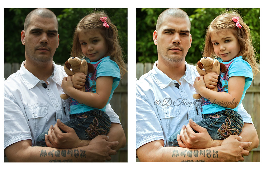
When my son stops by (which isn't too often), it's usually a quick pit stop on his way to somewhere else. The other day was no different, he had to hurry and pick the boys up from school. So, I quickly grabbed the camera and took a few shots before he left. No time to check camera settings, move them to a better spot or grab reflectors or flash. Just take the shot I have to go is usually how it is.
I would really like to save this horrible shot somehow but I've run out of ideas and I think the more I work on it, I just make it worse. After bringing up the exposure, my granddaughter's blue Kool-Aid mustache was extremely obvious as was the reflection of her blue shirt on her cheek so I have removed that. My son's white shirt turned a bluish-gray but I'm ok with pretending he had a bluish-gray shirt on ...LOL! I cleaned up his skin some and removed a scratch from her cheek. My son's eyes are so set in that even under the best conditions they always turn out so dark. My granddaughter isn't in focus as much as I would have liked but not much I can do about that now. I am hoping to at least get decent small prints out of this but not sure if that is even possible.
Should I start completely over or just chuck the shot all-together?  Also, is there a way to use the clone tool so that it doesn't totally ruin the texture and turn everything cloned to a smooth muck?
Suggestions welcome and if you'd like me to send you the file to see what you can come up with, I'd be happy to!

BA by Denise Trocio ( www.dtrociophotography.com), on Flickr
-
Senior Member

Personally I think your just being your own worst critic. While the shot is not going to win any awards, I think the fixed up shot looks pretty good. The expression on her face is great. Maybe if I was looking at the full size version I would see more problems but I think as a family photo that's only going to be printed small it looks good. The only real problems I see with the finished shot are his dark eyes, the hot spot on his shoulder and maybe a slight blueish cast to some parts. but I think those are very minor things.
-
Thank you Nick for commenting and thank you Wally for processing the original and sending it to me! I really appreciate the time you took to do this, it looks great! You got rid of the bluish cast, lightened the eyes and fixed the overall exposure beautifully!
-
Senior Member

You are welcome Young Lady. NIK software is my answer to lots of my only so so photos.
 Posting Permissions
- You may not post new threads
- You may not post replies
- You may not post attachments
- You may not edit your posts
-
Forum Rules
Also, is there a way to use the clone tool so that it doesn't totally ruin the texture and turn everything cloned to a smooth muck?


 Reply With Quote

