-
-
Re: A Few Birds Ready For Critiquing
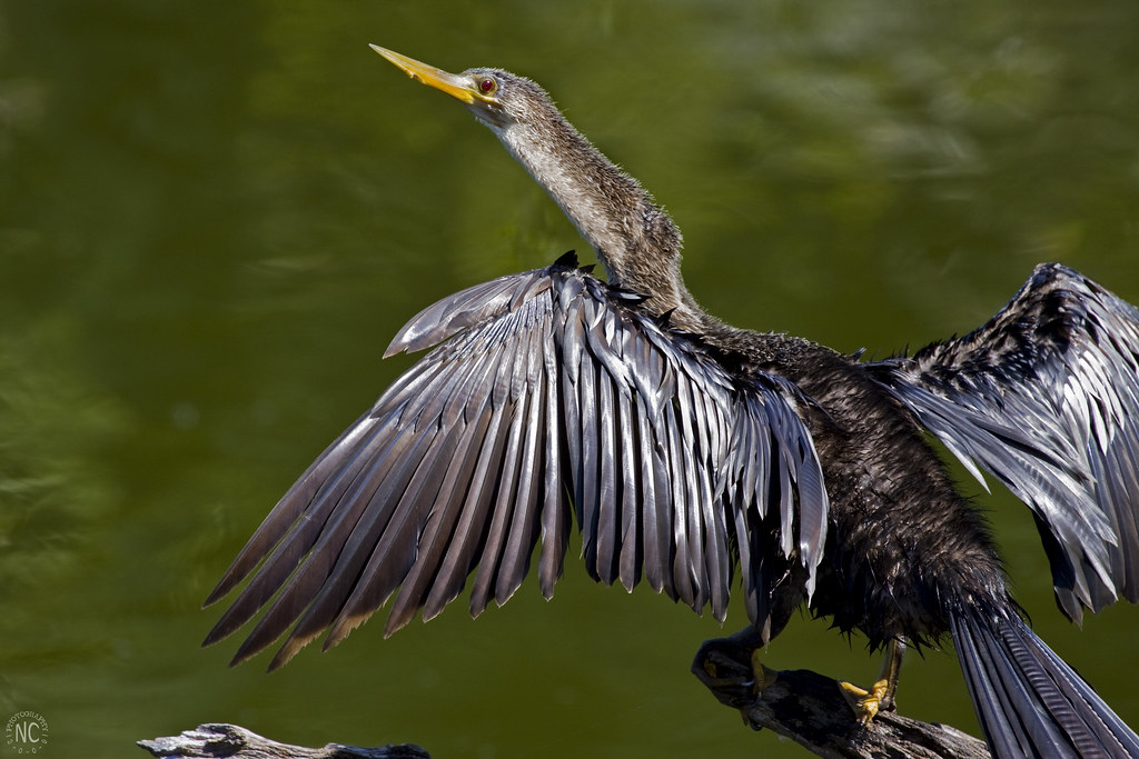
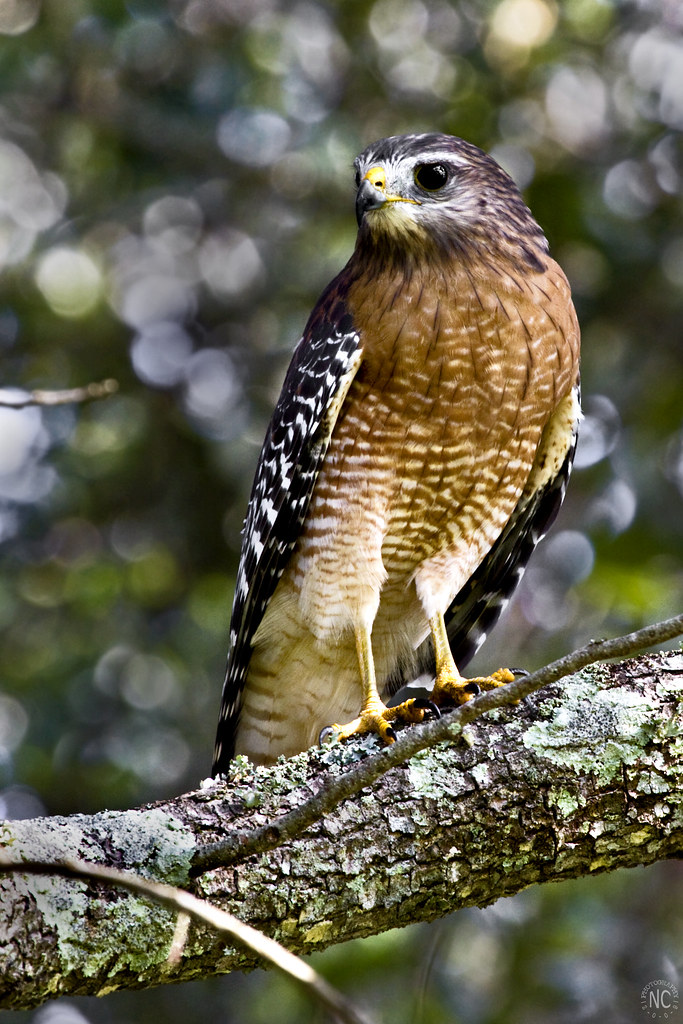
Fantastic work. The subjects are all very interesting, and the compositions hold my attention. I like the light in all, but perhaps the shadows on the last one are a little too dramatic for my taste. The hawk is my favorite, though it might be a little more saturated than I normally like. I wonder if cropping the top of the Royal Tern image a little more and going with a 16:9 or 2:1 aspect ratio would be an improvement?
Nice work!
-
Re: A Few Birds Ready For Critiquing
Thanks. I might try doing that to the Royal Tern pic. I was wondering if there was another crop that would help that pic a bit!
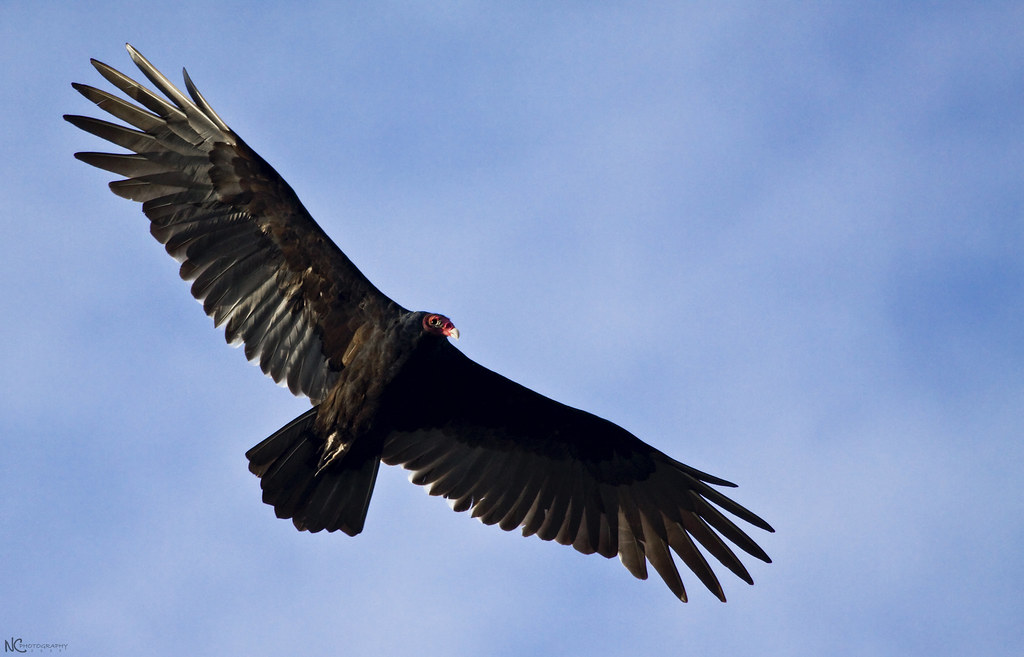
As far as the vulture goes, I agree that it is a bit dark. The sun was unfortunately overhead so no matter what I did, I was always in the shadow [ ]
]
I'm not happy with the contrast on the Hawk pic. He flew himself up into a shadowy tree with the little spots of light coming through and shining on him and the branch, so evening out the tones was a pain and I'm still probably going to change some things...oh well.
Thanks for the critique! Very good advice!
-
Senior Member

Re: A Few Birds Ready For Critiquing
IthinkHawk pic is a bit to contrasty for my taste, try re-postprocessing it in RAW with a little less contrast.
-
Re: A Few Birds Ready For Critiquing
I would recrop the Tern. The others are very good. I love the contrast on the hawk.
 Posting Permissions
- You may not post new threads
- You may not post replies
- You may not post attachments
- You may not edit your posts
-
Forum Rules


 Reply With Quote