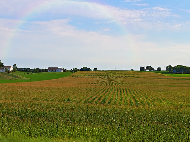
Lovely image, William.
Please include the processing steps, they are very handy for us beginners.
Steve U
Wine, Food and Photography Student and Connoisseur
I learn things best visually, so I'll use this method to show what I did. First the screen shots, then a point description to expand the details:
[img]/resized-image.ashx/__size/1000x1000/__key/CommunityServer-Discussions-Components-Files/12/0602.1.jpg[/img]
[img]/resized-image.ashx/__size/600x600/__key/CommunityServer-Discussions-Components-Files/12/5707.abc.jpg[/img]
[img]/resized-image.ashx/__size/1000x1000/__key/CommunityServer-Discussions-Components-Files/12/6116.8.jpg[/img]
[img]/resized-image.ashx/__size/1000x1000/__key/CommunityServer-Discussions-Components-Files/12/0310.3.jpg[/img]
OK, so here goes:
- Create a new layer (I use the little square icon by the trash-can in the layers palette, at the very bottom right hand corner of the screen shot)
- Select the gradient icon (be careful not to select the paint bucket, it's in the same menu)
- Open the Gradient Editor by clicking here: (a) Select this gradient icon, (b) Move each 'marker' or 'Stop' as I have done. I used the color picker and a rainbow color swatch (found on google images) to get each color. If you click on a 'Stop' you will automatically have it selected and the eyedropper (color picker) tool ready for selecting a color. (c) Once you are happy save the gradient.
- Select the radial gradient icon (This makes a bow)
- Drag out the gradient by clicking at the bottom and drag up to point 6 (holding down the shift key will keep your line straight). (make sure your new layer is still selected when you do this).
- Release your mouse and you'll have a rainbow (an ugly one)
- Change the blend mode from 'Normal' to 'Screen'
- Click on the move tool and move the rainbow where you want it. If you want to get fancy you can use the transform options in the Edit menu to put the bow on an angle or squash and stretch it into a better shape.
- Blur. Go up to the top menu and select Filter-> Blur -> Motion Blur. I found motion blur worked best for this image and I choose a 'Distance' of 214.
- Erase the bits you don't want and your done!
I think your entire photo looks great! The HDR application is perfect and the rainbow is very well applied for the scene! Thank you so much for providing very clear and detailed instructions that even I can follow! I will try your way of doing this on a few shots tonight to see how it goes.
I think your rainbow looks so much more real than the one I applied in this photo. The main thing that I don't like about mine is the shape so I think I will work on this one using your instructions and see how I do ...

Both look cool. not to be persnickity, but a couple things about rainbows to make them look more natural.
1. Rainbows are rarely seem in full bow formation, usually only partial.
2. Rainbows only form across the opposite direction of the sun, and usually when it
This is excellent info. I wanted to include some of this because it's important to know these things if you want the picture to be convincing. My picture isn't the best candidate but it was the best I had in stock. Great list - I didn't know some of these facts.
Rainbows are also often denser at the ends and this bothered me because my bow is the opposite. This is because the screen blending mode gives more color when laid over darker areas, so the light horizon only gets a light rainbow. Any tips how to fix this?
Something else that is helpful, and that's to look at a Flickr Rainbow Group and compare your results with the real thing.
@Chad - Thank you so much for the very informative input you have provided!! Your critique is very helpful as well as William's directions. As soon as I get a chance, I am going to put all of this together and try to apply another rainbow ...hopefully a more realistic one! Or better yet, maybe someday I will have a camera handy when I see a real one!
Thanks again!
Denise