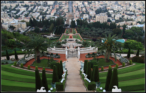
I think that the first crop is the best. The proportions just look correct to me.
I think that the first crop is the best. The proportions just look correct to me.
I like the middle one the best, but then I would []
But, that aside, it's enough of a crop to lose the 2 large buildings at the top which draw the eye away from the scene, yet still large enough to get a real sense of the environment.
Originally Posted by Oren
Thanks Oren, glad you liked my little joke...[]
I like the first one better.
Well Don - I preferred the original since the top part with the buildings was bigger - it adds a lot in my opinion. On the other hand you are right, the big building is distracting (which 2 big buildings? I see one... not sure about the other), so I removed it while still leaving as much of the buildings at the top as possible, there:
