


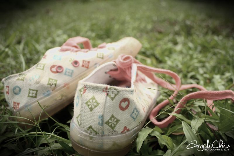
Hi everyone! I've been playing around with some post-processing and I thought I could ask your take on this one. Well, I just wanted to achieve a somewhat muted colors going towards those photos that are neither black and white and colored. Some sort of a mix of the two. Not really a color isolation but an over-all effect.
Thank you in advance.
- Angelo

 Reply With Quote

