Winter Sun
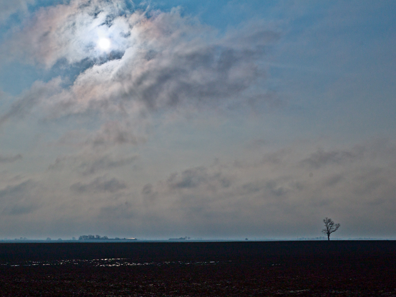


Winter Sun

Nice composition on both of these M Six and the light is great in the second.
Steve U
Wine, Food and Photography Student and Connoisseur

Another lighthouse at suset... sorry I like lighthouses.
Grand Haven Lighthouse at Sunset by westmichigan, on Flickr
5DS R, 1D X, 7D, Sigma 10-20mm f/4-5.6, 24mm f/1.4L II, 16-35mm f/4L IS, 24-105mm f/4L, 50mm f/1.8, 100mm Macro f/2.8L, 70-200mm f/2.8L IS II, 100-400mm f/4.5-5.6L, 580EX-II
flickr
Thanks, Steve. I knew when I left the house that morning that the light would be dramatic. Clearing skies usually are.
Pat, great shot, but I think I'd lose or at least reduce the vignetting. It would work with a B&W shot, but not so much with the color. Just MHO, of course.
I agree on the vignetting. I am not sure what happens when I post to Flickr, but the vignetting seems much harsher in flickr than in LR. I used the vignnetting because there was just to much gray in the upper part of the sky and the water forground. All that gray seemed to over power the color of the sky and lighthouse. The vignetting seemed to make the sky colors and lighthouse more of the focus, but in the end it turned out a bit to much.Originally Posted by M_Six

As for the B&W, I do not know... I will have to try it, but then I loose the color of the sunset. I will check it out and see.
Pat
5DS R, 1D X, 7D, Sigma 10-20mm f/4-5.6, 24mm f/1.4L II, 16-35mm f/4L IS, 24-105mm f/4L, 50mm f/1.8, 100mm Macro f/2.8L, 70-200mm f/2.8L IS II, 100-400mm f/4.5-5.6L, 580EX-II
flickr
You could use the gray to your advantage. I think the gray makes a nice color contrast scene with the yellow sunset. David duChemin covers this in his book, Photographically Speaking. Make one aspect of your image stand out by emphasizing a contrasting aspect. The colors in your image would literally bark at you if the rest of the image was more drab. I don't like selective color images, but in your case maybe subtly de-saturating the gray just a bit would make the reds and yellows really pop.
Beautiful lighthouse, Pat! I think our appreciation for lighthouses is do to our beautiful Lake Michigan offerings!! Hard to believe this one is just about right across the lake from me! One of these days, I would love to take the ferry over to the other side!
Thank you.
If you take the ferry, it sounds like you may to have to take the one into Muskegon because from what I here in the news the Badger that ports in Ludington/Manitowoc may have had its last season in 2011.
5DS R, 1D X, 7D, Sigma 10-20mm f/4-5.6, 24mm f/1.4L II, 16-35mm f/4L IS, 24-105mm f/4L, 50mm f/1.8, 100mm Macro f/2.8L, 70-200mm f/2.8L IS II, 100-400mm f/4.5-5.6L, 580EX-II
flickr

I really enjoy this thread and finally have one I can contribute.
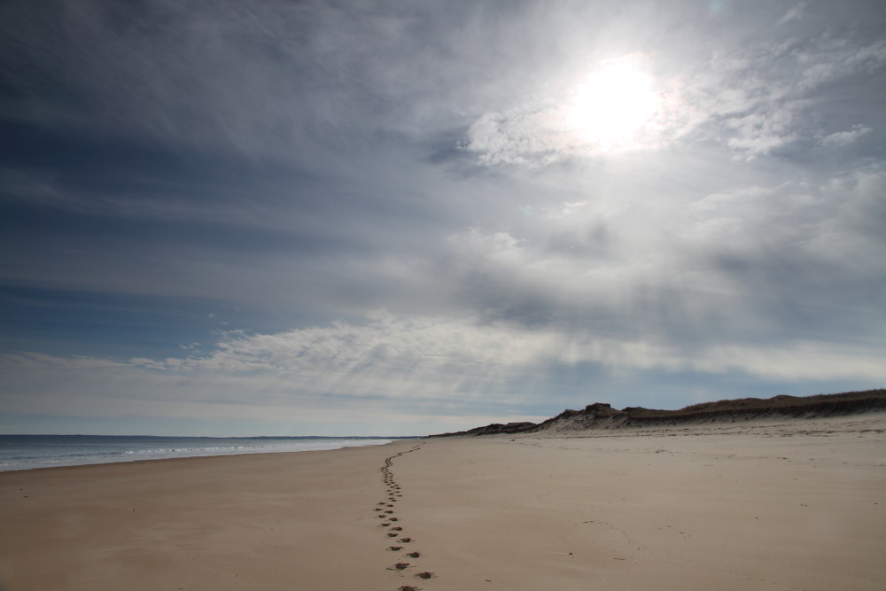
This is looking back as I hiked up the beach at Parker River NWR trying to find a Snowy Owl. Just missed one. A guy ~100 yds in front of me saw one in between dunes (blocking my view), ran up to it and scared the owl off.He happily showed me his pictures of it flying off....
But, at least I got this shot:
7D, EFS 15-85 @ 15 mm, 1/500, f/8, ISO 100 with a cokin grad 2 stop ND filter
Thanks for viewing....Brant
Brant:
Very beautiful shot. I am kind of envious... I lost my Grad ND filter holder, and the sun sets this time of year have a lot color around here.
This is nicely composed and expose shot. Thanks for sharing.
Pat
5DS R, 1D X, 7D, Sigma 10-20mm f/4-5.6, 24mm f/1.4L II, 16-35mm f/4L IS, 24-105mm f/4L, 50mm f/1.8, 100mm Macro f/2.8L, 70-200mm f/2.8L IS II, 100-400mm f/4.5-5.6L, 580EX-II
flickr
 Posting Permissions

 Reply With Quote