Results 1 to 4 of 4

Thread: Getting spiced!

  1. #1
    Senior Member MrGreenBug's Avatar
    Join Date
    Jan 2009
    Location
    Quezon City, Philippines
    Posts
    409

    Getting spiced!

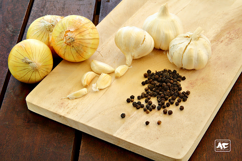
    Hello everyone. I'm back to get some feedback (positive and negative) on a recent photo I made. I'm kinda learning again.. For a little background, this was shot with the afternoon sun (all ambient). I used some black card board to block off some of the light that's coming from behind and I used white card board for fill light. If I remember correctly, this was shot at 50mm, f/13, 1/30 sec, ISO 200. I feel that the lighting is quite flat. What do you think?

    I'd love to hear your thoughts.


    Thank you for viewing.
    Cheers!
    --
    AnGelo Chiu (MrGreenBug in Flickr), Blog: http://mrgreenbug.blogspot.com

  2. #2
    Senior Member
    Join Date
    Jan 2009
    Location
    IL
    Posts
    778

    Re: Getting spiced!

    I don't know crap about food photography, but it does seem that the items are placed there and not because they were supposed to be there. Maybe a knife laid on it's side and slices of whatever splayed out. Like a chef had just plowed through some prep and took a break. Then I'd add some shadow to give it depth. Like I said though, I don't know food photography.. Or most anything else photography related for that matter
    Words get in the way of what I meant to say.

  3. #3
    Senior Member MrGreenBug's Avatar
    Join Date
    Jan 2009
    Location
    Quezon City, Philippines
    Posts
    409
    Quote Originally Posted by andnowimbroke View Post
    I don't know crap about food photography, but it does seem that the items are placed there and not because they were supposed to be there. Maybe a knife laid on it's side and slices of whatever splayed out. Like a chef had just plowed through some prep and took a break. Then I'd add some shadow to give it depth. Like I said though, I don't know food photography.. Or most anything else photography related for that matter
    Thank you for the feedback and I think your suggestion of a "messy" look could have worked. Will keep that in mind for next attempts.

    Quote Originally Posted by jrw View Post
    If working outdoors in the sun it might be worth trying early or late in the day to take advantage of the lower angle of the sun to make the surface textures pop a bit more. You have almost eliminated shadows which is a look that some people want but when you are asking if it is flat looking it might be time to try some low angle side lighting for a more dramatic surface.
    I originally wanted to work late in the afternoon but I'd be losing light relatively fast so I just decided the time where the sunlight is relatively constant. I'll try again sometime with your suggestion of shooting early in the morning so I won't be losing light instead I'd be getting more light as the day progresses. Thank you for your thoughts.
    Cheers!
    --
    AnGelo Chiu (MrGreenBug in Flickr), Blog: http://mrgreenbug.blogspot.com

  4. #4
    Senior Member
    Join Date
    Jan 2009
    Location
    Ottawa, ON
    Posts
    1,472
    Hey AnGelo,

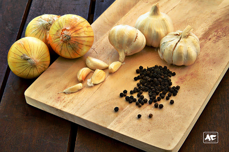
    Hope you don't mind I took your image for a test drive. It looked like there was shading, just subtle, so I tried to bring it out. Steps in the description on flickr.


    GreenBug_IMG_0015a by namethatnobodyelsetook, on Flickr

Posting Permissions

  • You may not post new threads
  • You may not post replies
  • You may not post attachments
  • You may not edit your posts
  •