Page 3 of 7 FirstFirst 12345 ... LastLast
Results 21 to 30 of 68

Thread: Reflections & Punctuation

  1. #21
    Senior Member
    Join Date
    Jan 2009
    Location
    Newfoundland, Canada
    Posts
    533
    Rocco;

    Good set!

    In the first one, I find the reflection on her glasses distracting. Might also be nicer if she wasn't taking a drink at that exact moment as the glass partly obscures her face. Other than those minor issues, I really like the lighting and posing (or lack thereof) of this shot. It has a certain "feel" that I like.

    The second one is cool; I like the way the smoke curls around the scene and still dosn't block the view of the subjects.

    The third one seems to have him too much in her shadow, it's a bit distracting.

    Four and five I really like, especially #4.

    All minor critisism, overall I quite like the set.

    Stephen

  2. #22
    Banned
    Join Date
    Jan 2009
    Location
    Utah
    Posts
    576

    Cool The Convict Bride

    It was time to do Nicole's bridals. We went out to the local botanical gardens and got the standard catalogue style shots.. and I wasn't happy with them at all despite getting some really good shots. It just wasn't her. It had nothing to do with her personality. The very same day I called her and got her to agree to a reshoot.

    I knew right away that she needed to be the badass bride (an idea supported by all of the middle finger pics from the last shoot that didn't make the cut.) My first thought was to use an urban setting rather than outdoors. Then I got the idea to do a night shoot.. Not too many bridals done after sunset. Then I thought of my buddy and his 57 Chevy pickup. I was worried about a truck like that being in the shot and stealing attention from her and her dress. The only way I could justify having it in the shot is if it was helping to tell a story and lighting her at the same time. But what story? To save you from reading a novel, here's the pic. You can decide what the story is. The main elements being the red police beacon light (powered by a vagabond mini), the handcuffs hanging off her wrist, and the grumpy cop getting out of the truck (my buddy, the owner of the truck).


    There was quite a few challenges in this shoot. Firstly I knew going in that with my settings it wasn't likely that the headlights would be bright enough for a kicker light on the bride, my solution was to gaff tape one to each headlight. I also knew that it meant that the beacon wouldn't illuminate in a believable way. I dragged my shutter to get color and detail in the light (1/30-sec) and took a stylistic license with a red gelled flash on the wall. Also the smoke needed a dedicated back light to show up on camera. My amazing girlfriend was nice enough to hide behind the bride holding a flash.


    I'm stoked with the results. I came up with an original idea and was able to capture her dress in a way that more closely matches her personality.

    As always, I welcome criticisms and comments. Thanks for looking guys!

    -Rocco
    Last edited by Rocco; 07-28-2013 at 07:01 AM.

  3. #23
    Senior Member
    Join Date
    Nov 2011
    Location
    Big Mouse Florida
    Posts
    1,189
    Quote Originally Posted by Rocco View Post
    It was time to do Nicole's bridals.
    -Rocco
    WOW - "out of the box" for sure. Really like it. Somehow the garden shots while executed well (eyeglass reflection not withstanding) don't seem to fit her. Clearly by her putting up w/ all this staging, I bet she really liked it.
    If you see me with a wrench, call 911

  4. #24
    Administrator Sean Setters's Avatar
    Join Date
    Jan 2009
    Location
    Savannah, GA
    Posts
    3,366
    I like the concept, location, props, and the lighting that's there. However, to me, it's missing something. In my opinion, it needed some light on the right side of the image. What kind of light? Well, either 1) a light shining down the road/alleyway to give separation, 2) a rim light on the back of the truck to match the rim on the driver's head (I think leaving the gridded light on him un-gridded but placed a little further back/behind the car might have done it), or 3) a touch of light in the cab of the truck, or a combination of all three.

    I mean, there is a light above the truck (on the wall) that could have easily been the motivation behind illuminating a bit of the scene behind the truck. It wouldn't have even needed to be a lot of light; just a touch would have brought detail into the scene that added to the overall effect, yet not take away from the focus on the bride.

  5. #25
    Senior Member Jonathan Huyer's Avatar
    Join Date
    Jan 2009
    Location
    Canmore, Alberta
    Posts
    1,263
    Oh I really like this. I'm impressed by the creative concept, and technical execution. The bright lights focus the viewer's first attention on the bride, as it should be. An instant later the eyes move to the truck, and we get the full humorous story. The Speedlights on the headlights are brilliant... I would have never guessed! Congrats -- I'm sure she must be quite happy with it.

  6. #26
    Super Moderator Kayaker72's Avatar
    Join Date
    Jan 2009
    Location
    New Hampshire, USA
    Posts
    5,670
    Inspiring shot. The thought and creativity that went into it, plus the story telling aspect, makes me want to go out and try something similar. Sean's critiques as to how it could be different are also thought provoking...
    Last edited by Kayaker72; 07-29-2013 at 11:32 AM.

  7. #27
    Banned
    Join Date
    Jan 2009
    Location
    Utah
    Posts
    576
    Quote Originally Posted by Sean Setters View Post
    I like the concept, location, props, and the lighting that's there. However, to me, it's missing something. In my opinion, it needed some light on the right side of the image. What kind of light? Well, either 1) a light shining down the road/alleyway to give separation, 2) a rim light on the back of the truck to match the rim on the driver's head (I think leaving the gridded light on him un-gridded but placed a little further back/behind the car might have done it), or 3) a touch of light in the cab of the truck, or a combination of all three.

    I mean, there is a light above the truck (on the wall) that could have easily been the motivation behind illuminating a bit of the scene behind the truck. It wouldn't have even needed to be a lot of light; just a touch would have brought detail into the scene that added to the overall effect, yet not take away from the focus on the bride.
    Sean.. thank you!
    You're insight has always been valuable to me. I've improved drastically in the past year with off camera flash and I'm glad to count you among my most valuable resources. Of course it needed light on the right hand side! That's why the light on the wall looks so dead. Don't know how I missed that, but I'll definitely keep an eye on ambient light sources in my frame from here on out.

    Quote Originally Posted by Busted Knuckles View Post
    WOW - "out of the box" for sure. Really like it. Somehow the garden shots while executed well (eyeglass reflection not withstanding) don't seem to fit her. Clearly by her putting up w/ all this staging, I bet she really liked it.
    She did. And best of all it made all of her friends and co-workers jealous. Who doesn't like making the people you care about jealous? ha.

    Quote Originally Posted by Jonathan Huyer View Post
    The Speedlights on the headlights are brilliant... I would have never guessed!
    Seriously! Turned out better than I had thought! Largely because I zoomed out both speedlights to 24mm. I had some lens flare to correct because of it, but I expected that.

    Quote Originally Posted by Kayaker72 View Post
    Inspiring shot. The thought and creativity that went into it, plus the story telling aspect, makes me want to go out and try something similar. Sean's critiques as to how it could be different are also thought provoking...
    Dude, do it. I wanna see.


    Part of showing my thanks for him letting me use his truck was a B.A. pic of it for him. I have never done automotive photography before so I just took a people portrait approach. I knew I'd be wide, that I'd balance my lights against the exposure for the sky, and that I would draw attention to the front of the truck as if it were a face. Love how it turned out. He already has a poster sized print on order. Took this one while we were waiting for the bride to show up.


    Anyone with more experience with these have some pointers for me? I wish I had turned on the headlights while taking this. That was added in post.

    -Rocco
    Last edited by Rocco; 07-31-2013 at 04:41 PM.

  8. #28
    Administrator Sean Setters's Avatar
    Join Date
    Jan 2009
    Location
    Savannah, GA
    Posts
    3,366
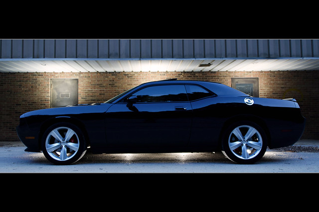
    The good thing about automotive photography is that you can shoot it with fewer lights. See this for example:


    Dodge Challenger [Anamorphic Widescreen] by budrowilson, on Flickr

    The car was my assistant's. We used his Nikon D7000 and three of my flashes to capture the image. The camera was tripod mounted, in manual mode, manually focused, with all settings locked in place. Then we simply moved the flashes around for each shot (3 total). Then we used Photoshop's "Lighten" blending mode to pull the lighted areas from each image into one final image. Even though we used three flashes, we could have just as easily shot it with one.

    The cool thing about shooting this way is that your lights can all be varied in brightness after the fact simply by adjusting the opacity of each layer in PS. If the light on the background is a bit too bright, you can always lower the opacity of the background light layer to lessen its intensity.

    For the above shot, I didn't really want to light his car. His car was deep black color. I wanted to preserve that look. So instead of lighting the car, I lit around the car and let the sky reflect off the top of it (giving the front of the car some detail and life). I wish we had modified the flash in some way so that the light underneath the middle of the car didn't look the way it did. I would have preferred the light to be more even and less inverted pyramid-shaped.

  9. #29
    Banned
    Join Date
    Jan 2009
    Location
    Utah
    Posts
    576

    Shadows and Dust

    "We mortals are but shadows and dust."


    Sometime around Halloween I got the idea to do a creepy photo of me and my girlfriend. In typical fashion I procrastinated and missed my mark, finishing it after Halloween, but decided I had better do it before it got too cold outside.

    I used my PCB Einsteins in a two light setup. The main light was firing through a large soft box camera left, and the key light was fired into an undiffused 64" PLM silver umbrella. Used the PocketWizard Power MC2 and TTI with the AC3 Zone Controller on the hotshoe of my 7d with the 100mm f/2.8L IS Macro attached. I was at 1/250th, f/8, ISO 100.. and if I remember right the main light was at about 1/8th and the key light somewhere around 1/4th. I'd have to go look at the dials on the AC3 to be sure.

    I had seen a few portraits done using white flour for various effects. I knew right away it would cover the majority of the skin on both of us, making us look dirty and animalistic. My father hung drywall for a living and I remember how ghost like and frightening he looked after he came home from work. I didn't make the connection until after the photo shoot was over, but I think the eerie feeling that he wasn't the same person stuck with me more than I knew.

    The effect was simple enough. I went to the local grocery store and bought 10 lbs of bleached white flour. We then took turns throwing the flour in each other's hair, in our faces, and covered everything else that would be visible. Because it was just me and her, with her youngest son to click the shutter for us, I decided it would be best to create two separate pictures to be combined in Photoshop later. With everything set up I had her son count to three and I threw a handful of flour at her back on the second count, giving it a second to disperse before the frame was captured. She did the same for me.

    I don't know what the hell I'm going to do with the picture except maybe frame it and put it on my desk until next October.. then I'm sure it will be all over my facebook. Some friends have suggested Christmas cards, engagement announcements, or thank you cards. All good ideas. heh.

    All I know is that it was SUPER messy (I'm still finding flour. Just today I found some in my wallet), SUPER cold, and most of all.. unbelievably fun. Not to mention how much fun her son had taking the pics. He's always had an interest in photography, even before I came around.

    As always, I welcome critiques and comments. Thanks for looking!
    Last edited by Rocco; 11-14-2013 at 09:42 AM.

  10. #30
    Administrator Sean Setters's Avatar
    Join Date
    Jan 2009
    Location
    Savannah, GA
    Posts
    3,366
    I absolutely love it! I would have never known it was a composite unless you had mentioned it (good job in post). You did a good job lighting the image for the ultimate gritty look. And the flour looks like an awful lot of fun (files that one away and thinks, "Good artists copy; great artists steal!"). :-)

    Seriously Rocco, you're stuff is getting better and better. Your creativity and master of lighting have combined once again for awe-inspiring results. Very well done. Wish I had thought of it for Halloween...

Posting Permissions

  • You may not post new threads
  • You may not post replies
  • You may not post attachments
  • You may not edit your posts
  •