-
08-24-2013, 07:13 PM
#421
-
08-25-2013, 12:30 AM
#422
Super Moderator

Patrick...love the feel B&W gives those images....
-
08-25-2013, 04:38 AM
#423
Thanks. I recently caught another airing of the Ken Burns National Parks documentary and was inspired by all of the old photos  .
.
-
08-25-2013, 01:57 PM
#424
Senior Member

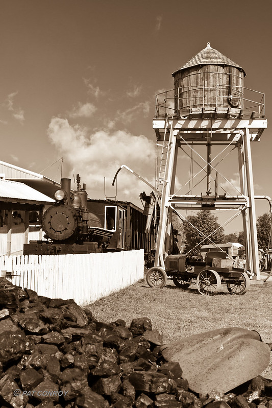
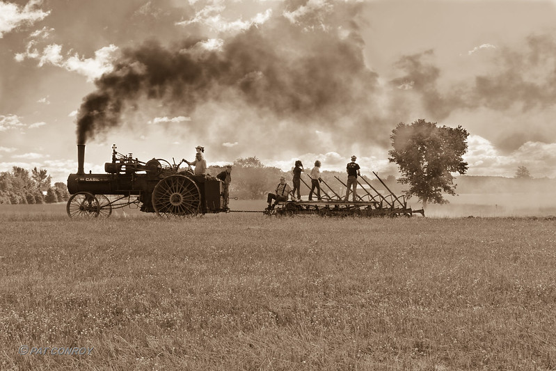
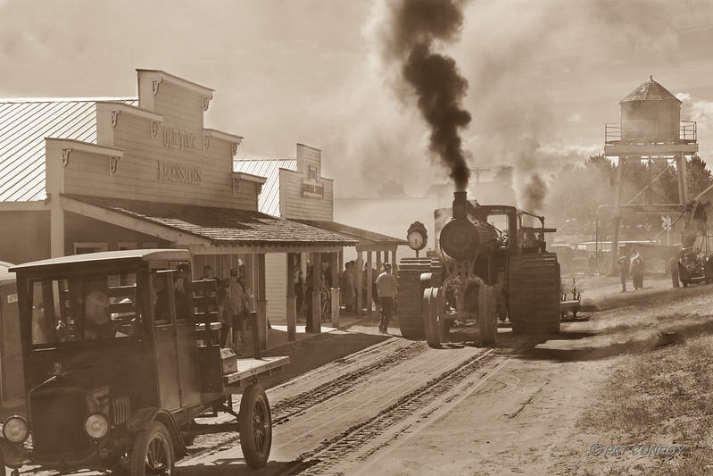
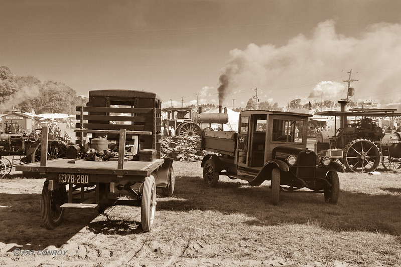
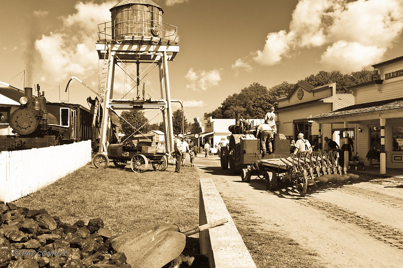
I did my yearly visit to the Buckley Old Engine Show. It is one of my favorite things to do, and look forward to it every year (sad life, aye). I tried to make everything look vintage, but baseball hats kind of messes that up.
Here are a few from last week (if anyone has any comments on how to improve the B&W antique picture look, please comment... I have LR3 to process, but I do not have PS):
Edit: After posting, I see #2 could use some cropping... the horizon is too centered.

Steam Train-5462 by westmichigan, on Flickr

Steam Tractor Plowing-5577 by westmichigan, on Flickr

Old Town -5496 by westmichigan, on Flickr

Buckley Old Engine Show-5406 by westmichigan, on Flickr

Old Town Scene-5479 by westmichigan, on Flickr
Last edited by conropl; 08-25-2013 at 02:39 PM.
5DS R, 1D X, 7D, Sigma 10-20mm f/4-5.6
, 24mm f/1.4
L II, 16-35mm f/4
L IS, 24-105mm f/4
L, 50mm f/1.8
, 100mm Macro f/2.8
L, 70-200mm f/2.8
L IS II
, 100-400mm f/4.5-5.6
L, 580EX-II
flickr
-
08-25-2013, 10:55 PM
#425
Pat, for me 2 & 3 are particularly great. The dust, steam, and smoke combine for a terrific effect.
-
08-26-2013, 02:55 AM
#426
Senior Member

Thanks Patrick. I like the ones with the smoke. When the steam engines use a lot of power, they really belch out a lot of smoke. So it seems more realistic. I had some of the train with a lot of black smoke, but the foreground was not as nice - so I weeded those out.
5DS R, 1D X, 7D, Sigma 10-20mm f/4-5.6
, 24mm f/1.4
L II, 16-35mm f/4
L IS, 24-105mm f/4
L, 50mm f/1.8
, 100mm Macro f/2.8
L, 70-200mm f/2.8
L IS II
, 100-400mm f/4.5-5.6
L, 580EX-II
flickr
-
08-26-2013, 04:10 PM
#427
I don't think I've ever submitted a picture to this particular thread, I figure this one is good enough to be my first. Another shot of my friend Matt performing in his band.

-
09-09-2013, 06:17 PM
#428
Senior Member

-
09-09-2013, 06:58 PM
#429
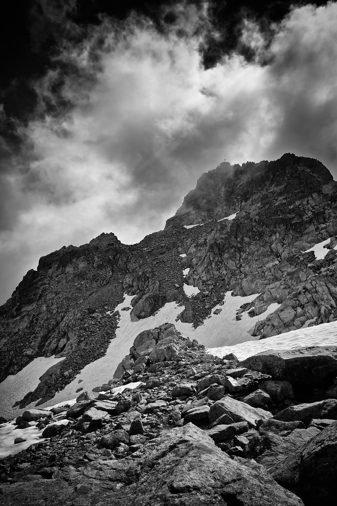
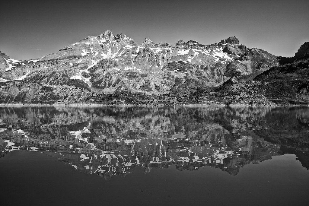
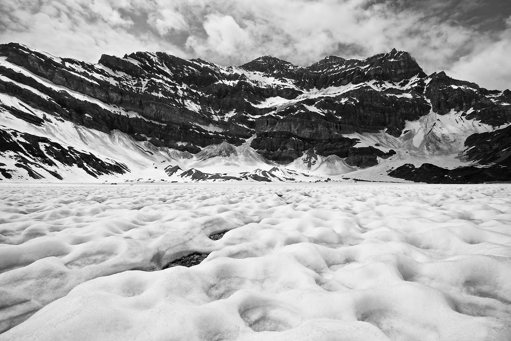
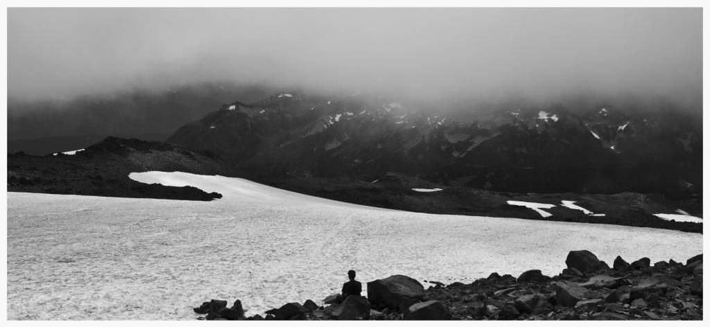
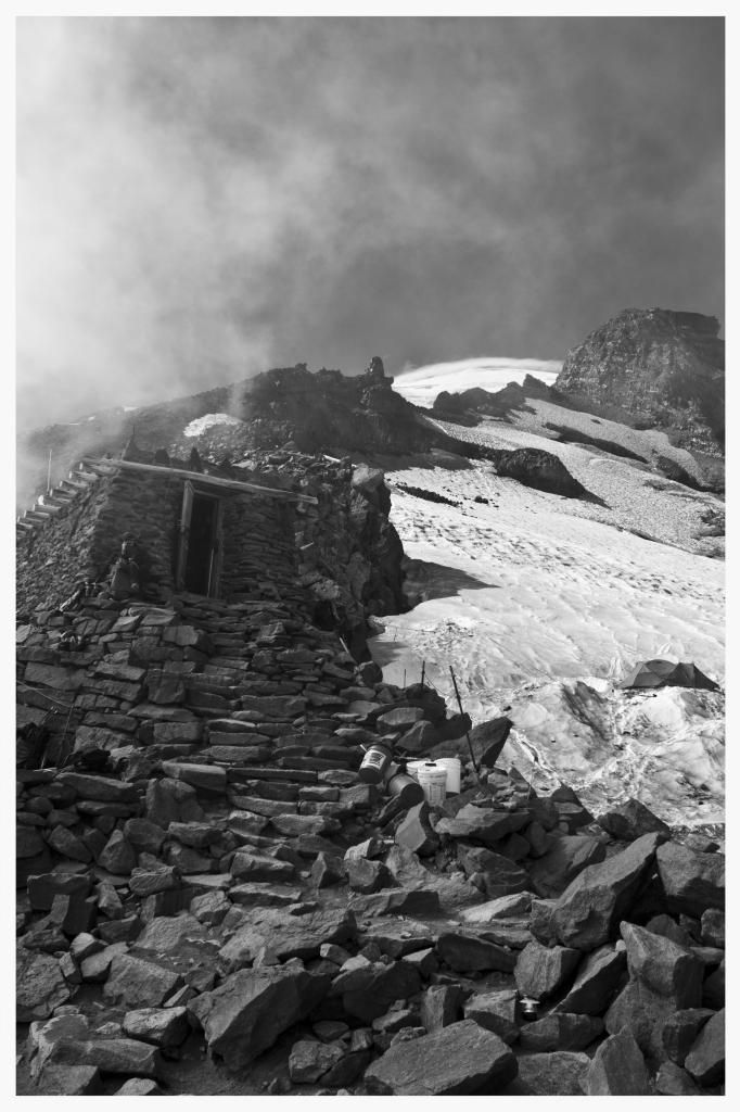
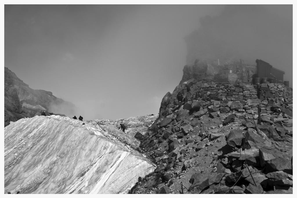
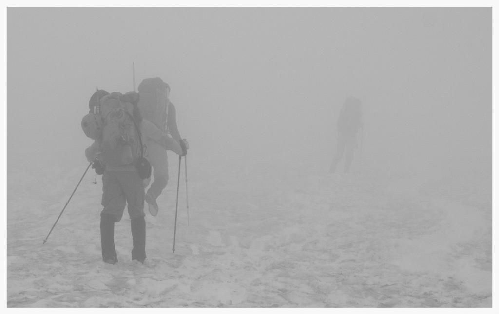
I like the last picture best. I like the contrast and the sky. It looks very dramatic. The first image could perhaps benefit from some more contrast? But it is matter of taste, I guess. It would be interesting to see image 2 in colours. I suspect that there is a brilliant blue sky...
Lars
-
09-11-2013, 01:56 PM
#430
Senior Member

Thanks for your constructive criticism Lars. I'm still learning how to use black and white, so it's really useful to get some advice.
You suspect well for the second image, but somehow the other colors weren't so great. I prefer the B&W version by far.
 Posting Permissions
- You may not post new threads
- You may not post replies
- You may not post attachments
- You may not edit your posts
-
Forum Rules


 Reply With Quote
 .
.

