
Originally Posted by
Richard Lane
Hey Denise,
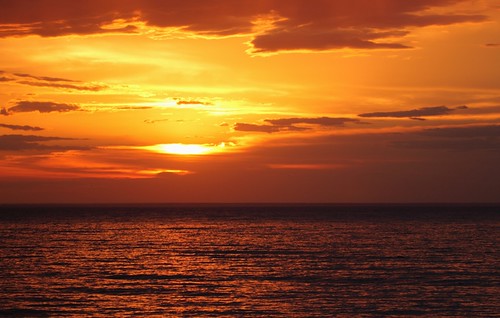
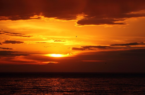
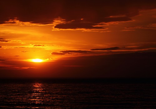
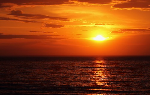
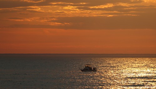
Those are great! Number 3 is my favorite with the 2 birds and I like that you have more sky and less water.., the clouds and Sun look awesome. I like #4 too, because I like the reflection of the Sun on the water, as well as the cloud formation, but it does look a little dark on the bottom right side. #5 is brighter, but less clouds. So, #3 is definitely my favorite!
Great Job!
So, tell us a little bit about the settings, filters, and set-up that you used.
Rich
<div style="CLEAR: both"]</div>


 Reply With Quote
 ]
]
 ]
]

 ]
]