-
C&C On Desktop Wallpapers
Brief introduction to my post: I am quite new to photography; in fact, I bought my first camera(a Canon EOS 20D)in late May of this year from my brother. I haven't had any classes, apart from a photography textbook and my Father's and Brother's tips and comments.
I do not intend to 'soften' my audience with the above introduction; but rather explain where I have come from, and where I currently stand. With that said, I haveadornedthis site's fantastic reviews and find myself spending ample amounts of time browsing around. But until recently, I haven't known about the Community & Forums aspect of the site. So, thank you all (and especially Bryan for the essential tools this site offers for free).
Alright then, enough with the talking. Here are some photographs I have taken (and submitted to InterfaceLift.com (for those who may know about that site); unfortunately I haven't had much success there since I'm competing with somephenomenalphotographs and equipment..). Regardless my hope here is to receivesome feedback on the photos that I can build upon for future development in my photographicjourney.
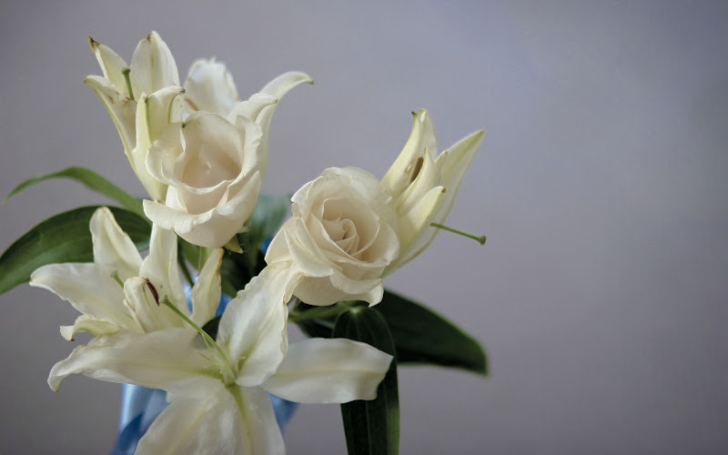
Canon 20D, Lens: 50mm 1.4 IS USM, taken at f1.4, ISO 100, and 1/100 shutter, MF Handheld.
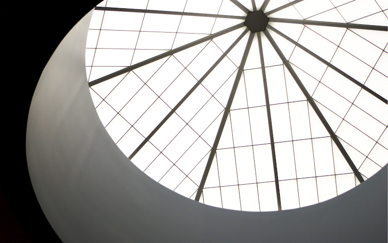
Canon 20D, Lens: 28-135mm f/3.5-5.6 IS USM, taken at 28mm, f3.5, ISO 400, and 1/200 shutter, Handheld
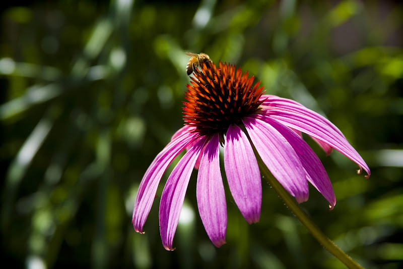
Canon 20D, Lens:28-135mm f/3.5-5.6 IS USM, taken at 127mm, f6.3, ISO 100, and 1/250 shutter, Handheld
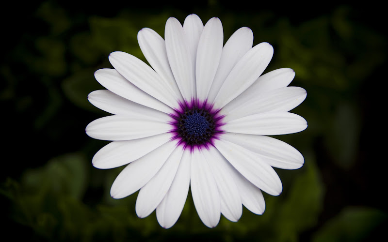
Canon 20D, Lens:28-135mm f/3.5-5.6 IS USM, taken at 80mm, f5.0, ISO 100, and 1/320 shutter, Handheld.
So there is four of them.. Feel free to visit my Picasa (should be able to click on the image itself..) and download the full sized images.
Well that's all I have; thanks for taking time to look and read; I would love to hear your thoughts and opinions! Maybe others would want to post some 'Desktop Wallpapers' that they too would like critiquing? I wouldn't mind turning this into a background sharing thread either.
Anyhow, Blessings, and I look forward to being apart of this wonderful community!
-
Senior Member

Re: C&C On Desktop Wallpapers
Welcome to TDP, Michael! Those are great even for starters. I've visited your Picasa and have added you to my favorites
-
Re: C&C On Desktop Wallpapers
Thanks MrGreenBug! (not sure how I view your actual name..) I took the liberty of adding you as well; I must say, I really like your Car pictures. Out of curiosity, where was the 'Transport Show' located? I've never been to a car show, but that seems like a lot of fun. Thanks again for your comments! (I wasbeginningto wonder if anyone was going to comment... I suppose I've had less to do today than normal, thus I have been checking quite often)
-
-
Re: C&C On Desktop Wallpapers
Very nice photos, Michael! The photos above are really nice & I like the car one you have on your Picasa account ...it looks like something right out of an advertisement! Also, thanks for reminding me about my own account, I have not used it yet but will ad photos later today!
Denise
-
Re: C&C On Desktop Wallpapers
Thanks Denise! I do, however, believe you give far too much credit to that photo of the car; I just took a snap-shot of it the day after I got the windows tinted.. [ ]In any case, once you add some of your photos, you should add/look for my picasa so I can add your photos to my favorites as well. Thanks again for commenting, and if anyone (and I do mean anyone) has comments and/or critique, I am all ears!
-
Re: C&C On Desktop Wallpapers
Hey Shalom24,
I have to say that I love the last picture. The contrast of the flower and the background, the purple in the middle, and the spot-on centering are great.
Now, this is a C&C, so time for my two cents [ ] whatever they may be worth. The first things I noticed were that I didn't get a clear subject (window?) out of the second shot, and the third one was sharp on the flower, but a little blurry on the bee. But that's just me, I'm really picky- I have only 3 pictures I really like from my vacation where I took 2500.
-
-
Re: C&C On Desktop Wallpapers
Hey and welcome to the forums. Hope you are enjoying yourself here. I have enjoyed the critiques and encouragements on this website.
Anyway. I like your shots. The last two are may favorites. Since you mentioned it, the idea of a wallpaper makes me think that the last two images are to high contrast. Most that I have seen are fairly flat in terms of contrast and different colors. They are generally heavily one tone and lower in contrast. Just my thought.
Samuel
-
Re: C&C On Desktop Wallpapers
Welcome to the Forum,
As a new photographer, I give you a lot of credit for posting your photos for critique.
Photo 1) I don't like the first picture at all for a number of reasons. The first one being that the flowers look nearly dead to me; I read on your website that these were cut flowers from the day before and unfortunately it shows, since the white petals appear brownish at the tips. Hopefully, there is some photographic knowledge to be gained from this photo, so here it goes. I don't like the composition of the flowers, because there is no true focal point for the viewer. The three flowers are competing with each other for attention and the bottom one is cut off, sometimes this could work if there were a focal point that would draw the viewers attention away from the fact that the bottom flower is cut off.
Sometimes, you can make a focal point with composition, and other times you can make a focal point by making one flower sharply in focus while the others are blurred intentionally by using depth of field and a wide aperture, which the 50mm f/1.4 can do very nicely. Since these flowers appear to be close to the same plane the wide aperture is not giving you the effect that I'm referring to. I also don't like the blue ribbon in the background, because I find it distracting. The lighting is poor and there is vignetting in the corners. I also don't like the drab color of the background since there is not enough contrast as compared to the color of the flowers. I also don't like all off the dead space on the right side of the photo. To tell you the truth, this would have been a photo that I would have deleted. Sorry, about the harsh critique, but I hope that you will find it helpful.
Don't worry.., Your photos get much, much, better from here on!
Photo 2) Not much to criticize here, as I actually like this shot a lot, and I find it very interesting. This is my favorite one of yours.
Photo 3) On the positive side; I think this one has the best composition of your 4 photos, and you have a nice capture of the bee.
On the negative side; the image is a little soft and the background bokeh is a little nervous looking as opposed to creamy. The center portion of the flower and unexpected bee are slightly OOF. This may be due to a few factors; one, is that the shutter speed was too slow to capture the bee in motion, however that won't explain why the flower is slightly OOF, so perhaps there was also wind blowing the flower around, or you may have moved slightly.
Unfortunately, the light is very harsh in this photo, which causes sun reflections on the purple petals as well as the color purple to be washed out. Sometimes, a circular polarizing filter can help tame the reflections and better saturate the colors in mid-day harsh light.
Photo 4) Although photo 2 is my favorite, photo 4 is probably your best photograph. The contrast and color saturation are wonderful, this photo has much better lighting than photo 3, and it appears that it was either taken later in the day or closer to the shade. The bokeh is simple and creamy. The focus is spot on, and although the flower is a bit soft, it's probably due to the lens quality, but soft flowers are very pleasing. Others may suggest that you shouldn't center a solo image in the middle of the frame, but I would say that this photo works for me, and I like it a lot.
Well.., there you have it, I hope you don't think that I was too harsh like the mid-day light.
Keep On Shootin,
Rich
 Posting Permissions
- You may not post new threads
- You may not post replies
- You may not post attachments
- You may not edit your posts
-
Forum Rules


 Reply With Quote

 ]. 'Transport Show' is an annual car event here in our place (Manila, Philippines). It was a haven for car enthusiast before and now for both car enthusiast and photographers. The organizers usually hold this for 3 days with different activities depending on their theme. Practically, it's a showcase on modified aftermarket cars and as well as collectibles.
 ] I'm looking forward for other opportunities to shoot cars. It's very much different than I usually shoot and so I welcome the experience.
 ] whatever they may be worth. The first things I noticed were that I didn't get a clear subject (window?) out of the second shot, and the third one was sharp on the flower, but a little blurry on the bee. But that's just me, I'm really picky- I have only 3 pictures I really like from my vacation where I took 2500.
 ] Too bad I didn't know about it then (but then again, I can't really see too much with the 20D's screen/resolution size). For whatever it's worth, I think the problem lay with in my focus method for that shot; I used the 'center-weighted' auto focus; but I believe I only metered the flower. So.. again, next time..