-
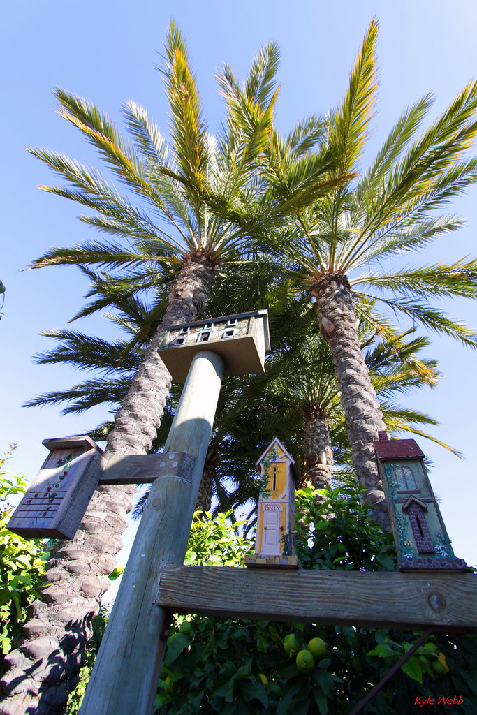
This one I call "Verticle"
Settings for Verticle
Camera: Canon 50D,
Lens: EF-S 10-22m, f/3.5-4.5,
Focal Length: 10mm,
Aperture: f/4.5,
Shutter Speed:160,
ISO:200,
White Balance: Auto,
Exposure Compensation: +1/3

Ok, I'm probabably maxed out on my allowable memory space now. No more for today.
Kyle
-
Re: This one I call "Verticle"
You can tell when a picture isn't so good: There are no comments posted on it. Such is the case with this one. Yes, I know its over exposed but the perspective I thought was good. You have to have been there to appreciate how I got the shot. I was almost laying down looking straight up to grab it with a 10mm focal length. Those bird houses aren't bird houses they are butterfly houses (see the very narrow slits for entrances. I should have spent more time and taken a couple of more shots with less exposure. This would have made the sky blue and the colors pop out. Oh well, I will try to better next time. This shot was taken at the California Adventure park at Disneyland near the entrance to the bugs life area.
Kyle
-
Administrator

Re: This one I call "Verticle"
Kyle,
I think your composition is good (and the subject is interesting). I think the lighting might be your biggest problem in this shot. You primary subjects are in the shade. You might try shooting this one at a different time of the day - or add some flash.
-
Re: This one I call "Verticle"
Bryan,
Thank you for your input! You are so right!
Kyle
-
Re: This one I call "Verticle"
I remember the day I got my 10-22. Living in a dense city like Athens, I must have escaped death-by-crazy-Athenian-motorist dozens of times, walking around with my head up enjoying the verticality of everything. Enjoy your lensand keep going. Below is an example of what I get up to with mine.
I agree with Bryan and would like to add something. You might want to try sharpening it a lot more and perhaps convert it to B/W with more contrast. I find that mono sometimes expresses better the composition than colour, especially when lighting is problematic.
[img]/cfs-file.ashx/__key/CommunityServer.Components.UserFiles/00.00.00.23.67/081009_5F00_Athens_2D00_geometric_5F00_2129.jpg[/img]
-
Re: This one I call "Verticle"
Stefan,
Thank you for your inputs, all good stuff. I am still learning and glad to pick up jems when ever I can. I like your imabe above, very sharp and awesome perspective.
Kyle
 Posting Permissions
- You may not post new threads
- You may not post replies
- You may not post attachments
- You may not edit your posts
-
Forum Rules


 Reply With Quote
