Page 1 of 2 12 LastLast
Results 1 to 10 of 12

Thread: Flower

  1. #1

    Flower


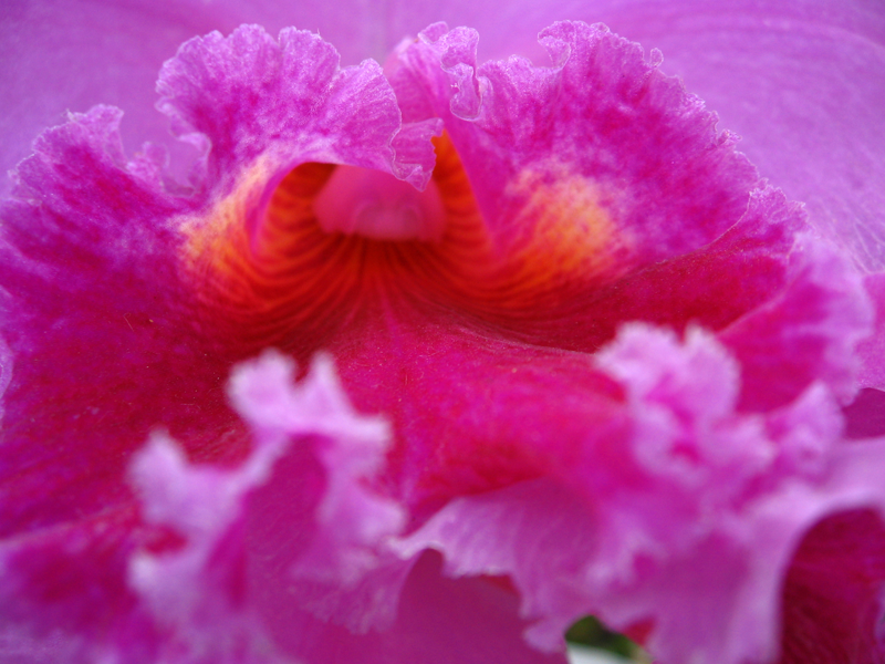
    1. Orchid [macro]


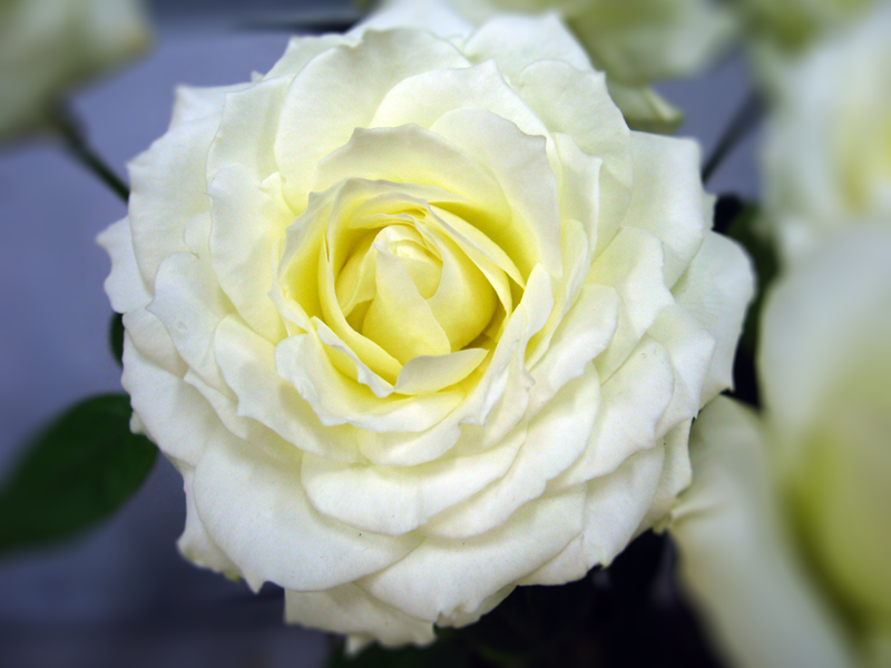
    2. Rose-white


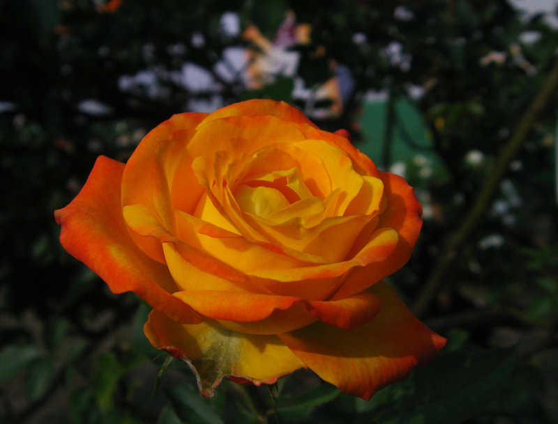
    3. Rose-red+yellow [cropped a bit]


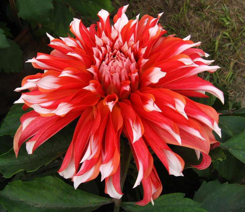
    4. Dalliah-1 [cropped off top and bottom]


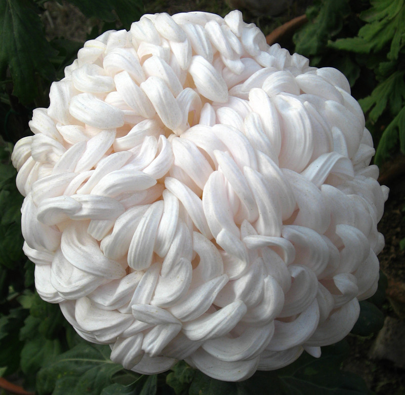
    5. Chrysanthemum-Snowball [cropped]


    6. Chrysanthemum-unknown-1


    7. Chrysanthemum-spider


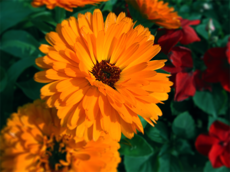
    8. Zenia [macro]


    All photos are post processed for a little Brightness/Contrast
    adjustment. Some are PPd to remove dusts from the surface of the subject. Photos are taken at a Flower exhibition - on Dec-25-2008 in Assembly garden, Kolkata, India


    link of the album


    http://s128.photobucket.com/albums/p183/home_me/Flower%20exhibition%20-%20Dec-25-2008/


    Please make your valued comments ....


  2. #2
    Senior Member
    Join Date
    Dec 2008
    Posts
    199

    Re: Flower


    Could you also post the exif data, camera and lens? Im going to assume you are not using a macro lens, and I could totally be wrong with this. I would use a lower f/stop if at all possible to give the photos a nice bokeh (background blur). But you have to make due wit what you have at the moment. I myself do not have macro yet so I feel your pain, if you are not using one.


    IMO the first shot lacks some focal point. Yes you have a flower but something seems missing to me. Again, may be completely wrong. It is all subjective. The little green leave at the bottom is distracting.


    I like six and seven the most. Six is overexposed, but not too bad. I dont know if you shoot RAW or not, but you might be able to bring it down some granted that it isnt already blown out. Do you bracket your shots?


    Again all shots would benefit with a lower f/stop.


    Aside from one, six, and seven, I feel that the composition is "ehh." I don't know if you took careful thought about how you would frame the shots. Everything seems just almost dead centered. I do the same thing at times then realize later I should have implemented the "rule of thirds," granted you dont always have to use it.


    Ok sorry for being very very crtical. I am just procrastinating on my poetry paper and trying to find something else to do except it itself. I am sure that my stuff probably suffers from everything I just mentioned about yours too. [:#]

  3. #3

    Re: Flower


    Wow, these are great pictures! I like 3,4,5,6 the best because the shot is not looking straight down. It's more artistic and less clinical. I don't agree with powers_brent, I don't think the rule of thirds applys here (except for 8, maybe), as there is one subject matter filling the frame. Just like the rule of thirds might not apply you were taking a frame-filling shot of a face. For 8, it's too busy, I'd crop it. But with the orange at the lower left and red at the upper right, it's not isolated enough. The problem with a lower f-stop is shallow depth of field. Which might look nice for the background blur, but the character of the subject matter would totally change, and become more dreamy/hazy. I'm really impressed with the way you have great depth of field for your subjects without turning the background black. Good work.

  4. #4

    Re: Flower


    First of all I would like to say sorry for I forgot to mention the equipment...


    It's Canon Powershot A530 (3yrs old) , 5 mp 4x Zoom (35-140mm 35 m eq), f no. for wide 2.6 or 5.6 and for tele 5.6 to 11 (plz note no in between f no., either max or min[:P]). JPG only capture.


    All pictures were taken in manual mode


    @powers_brent


    Yes a macro lens is a distant goal, right now I am having the pain of not having a DSLR...


    First pic.. I agree with the focal point issue. Actually with a 1.8" 77K pixel LCD I find it difficult to judge the subtle errors of focal point selection. As for the 'little green leave' it is green backdrop curtain. The hosts of the exhibition lacks in visual sense, they placed red flowers in front of green backdrop. I will try to crop it off.


    For a P&S it is hard to get any background blur and the only way to keep the distracting back off is to fill the frame with subject or use macro mode if possible.


    Yes I am aware of rule of thirds and try to use it if I find possible. [my album]. But at this venue it was impossible for me to use it any way. There was hell lot of distraction around each object. Both in foreground and background. It was the most poorly organized exhibition I've seen.


    @Steve Eisenberg


    for 8 I shall try if cropping makes any better...


    Good depth of field is a virtue of P&S but lack of shallow depth of field is a pain for many other situations


    Thanks all of you for your time and thoughts

  5. #5
    Junior Member
    Join Date
    Dec 2008
    Posts
    9

    Re: Flower


    Very good for a P&S. The only thing I can say is that 1 is not a rhododendron, it is a Cattleya Orchid. I very much like the color saturation of each!

  6. #6

    Re: Flower


    Quote Originally Posted by bassmangtk


    1 is not a rhododendron, it is a Cattleya Orchid.
    <div style="clear: both;"]</div>


    You are right [:$]

  7. #7
    Senior Member
    Join Date
    Dec 2008
    Posts
    465

    Re: Flower


    So, after having seen some of these pics, remind me again why I just spent $900 on a 40D kit? []


    Nice work. I especially like 2, 3,4 and 5.

  8. #8
    Senior Member
    Join Date
    Dec 2008
    Posts
    779

    Re: Flower


    Quote Originally Posted by HiFiGuy1


    So, after having seen some of these pics, remind me again why I just spent $900 on a 40D kit? [img]/emoticons/emotion-2.gif[/img]
    <div style="CLEAR: both"]</div>

    because the chicks dig it...

  9. #9
    Senior Member
    Join Date
    Dec 2008
    Location
    Algonquin IL
    Posts
    259

    Re: Flower


    It looks like it was a great exhibition and I appreciate they don't set them up with photo ops in mind. The great thing about flora is that you can get great results from a wide variety of equipment. Everything from full garden shots to macro shot of single petals can make for a pleasing photo. The trick is understanding what the equipment you are using excels at and frame your shot accordingly. For example, with a PS you know you can't get a thin DOF so frame your shot in anticipation of that. Filling the frame like you did with the Snowball works well. The other general tip I'd offer in these kinds of close ups is you don't generally want to lead into the shot with the front of the flower being out of focus, unless you can achieve a thin DOF and are intentionally shooting bits of the flower. The rule of thirds is pretty important if you're shoot a full flower including stem but not as much when just shooting the bloom. When shooting the bloom though look for interesting lines, angles, triangles, textures that draw you into and lead you through the scene. Then use your rule of thirds for placement whenever it makes sense.


  10. #10

    Re: Flower


    @Don Burkett


    No the exhifition was overcrowded by (atleast 10 times more ) items
    even for the normal viewer too... No way I can justify bright red,
    purple and pick flowers in front of geen backdrop... But apart from way
    of display the items themselves were great.


    Thanks for your tips. They are thought-provoking. One thing I must
    confess, though the rule of thirds was in my mind I could not find any
    way to apply it. Particularly this rule is easy to implement on my
    camera for the rule of thirds grid is always enabled on the LCD
    display. I honestly tried but failed. May be the situation was way out
    of my limitations or my camera or both


    "When shooting the bloom though look for interesting lines, angles,
    triangles, textures..." very good tips. I will surely try this next
    time. May be its time to move beyond rule of thirds making it as a base.


Posting Permissions

  • You may not post new threads
  • You may not post replies
  • You may not post attachments
  • You may not edit your posts
  •