Personally... I would leave the shirt alone for the reasons you already gave, but I would see what it would look like to darken the bow on the collar (it is a detail that seems a little lost).


Personally... I would leave the shirt alone for the reasons you already gave, but I would see what it would look like to darken the bow on the collar (it is a detail that seems a little lost).
5DS R, 1D X, 7D, Sigma 10-20mm f/4-5.6, 24mm f/1.4L II, 16-35mm f/4L IS, 24-105mm f/4L, 50mm f/1.8, 100mm Macro f/2.8L, 70-200mm f/2.8L IS II, 100-400mm f/4.5-5.6L, 580EX-II
flickr

I am of the opinion that the shirt makes up 30-50 % of the pixels and my eye IS drawn away from the face to the shirt.
I like the contrast in the face and the backgound with its bokeh.
The shirt probably some light greens, to yellows, and some light reds.
A shirt with some blue would have provided some pixels for contrast, but we usually can't pick such things.
You could crop if that suited you or since the shirt has some nice texture try a light burn tool to increase contrast.

I think the main distraction in this shot is the dark background just to the left. The mottled background on the right gives a more pleasant transition to the face. And it is the darker greater contrast of the background on the left that accentuates the lightness of the shirt. I think the shirt and the face contrast well together in a pleasing balance.
Steve U
Wine, Food and Photography Student and Connoisseur

I don't have any hard rules applied towards B&Ws, but more approach it on a case by case basis. A couple of mine before and after over the past few months:
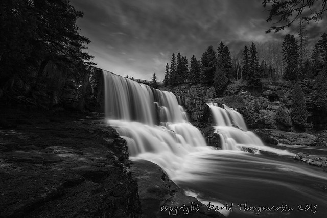
2013_04_07_0254_upd_bw by dthrog00, on Flickr
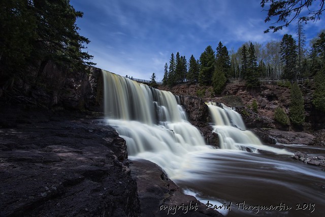
2013_04_07_0254_upd by dthrog00, on Flickr
2013_05_29_1953-1_bw_upd by dthrog00, on Flickr
2013_05_29_1953-1_upd by dthrog00, on Flickr
I usually prefer my B&W images punchy. I usually start with one of the PSE 10 presets and then tweak levels to give it bite. The classics for B&W I think are geometric shapes or patterns and vintage scenes as was mentioned previously.
Thanks for viewing.
Dave
See my photos:
http://www.flickr.com/photos/dthrog00/

I agree with you Steve. I wish that wasn't part of the background as well. Maybe one day I'll take the time to come back to this image and try to remove that distraction.
Thanks for all the opinions. I spent another 5 minutes with it tonight and here's what I got. I certainly like this better than the original. I feared that it would pull your eyes away from the face, and after my initial adjustment of the shirt, it was too dark, and I did catch myself distracted. So, I backed it off some and here's the result:
130602-0060-JAR.jpg by rlriii13, on Flickr
Dave, your waterfall conversion is interesting because the first things I noticed in the color version were the streaks of brown-orange in the falls. In the black and white, that's a lost detail. Perhaps you wanted it gone.
I could see a case easy way for the color of the water. I think I like the B&W better mostly due to the appearance of the clouds and maybe a bit more depth.
I like your updated edit with the presence the bow now has.
Dave
See my photos:
http://www.flickr.com/photos/dthrog00/
 Posting Permissions

 Reply With Quote