iND
I must ask, while you were in Paris, did you get a chance to look through the Albert Kahn Museum? That houses one of the best collections of early BW photography.


iND
I must ask, while you were in Paris, did you get a chance to look through the Albert Kahn Museum? That houses one of the best collections of early BW photography.
Canon EOS 7D, EF-S 10-22, EF 24-105L, EF 50 f1.2L, EF 70-300L, 430EX.
"Criticism is something you can easily avoid, by saying nothing, doing nothing and being nothing." - Tara Moss

How quickly we forget. Well said.Originally Posted by jrw

Having "been there, done that" there was a different feeling of accomplishment with pulling off a really good image. Sort of reminds of when I had to walk to school, uphill, both ways, with newspaper for shoes....
If you see me with a wrench, call 911

The museums I did visit other than the Louvre included:
Henri Cartier-Bresson Gallery (not the Foundation)
2 Impasse Lebouis, 75014 Paris, France
Européenne de La Photographie
5-7 Rue de Fourcy
75004 Paris, France\
Centre National d'Art et de Culture George Pompidou
19 Rue Beaubourg, 75004 Paris, France
The Albert Kahn Museum was outside the city but is on the list for the next visit, now that I have the subway system figured out
Well, this thread is certainly appropriate for what I've been doing lately, seems all that I do is shoot B+W these days, all on film.
So to celebrate, I'll share this picture. It has been a long long long time coming.
I took it in March, down the Great Ocean Road. Mamiya 645AF, 45mm f/2.8, CPL, Efke KB25.
First problem, Efke has a nasty habit of sticking to everything when you develop it, like the rollers of the machine at the lab that processed it, half the backing plastic came of in chunks (this was the main reason I've started developing all my own B+W at home now).
I bought a printer (Epson R3000) a few months ago, I tried getting it working on a virtual Windows on my main PC, after a week of headaches, I gave up and formatted my old laptop. It worked enough for printing, but copying to USB each was just annoying, and laptop screen is not as nice as my U2711.
A few weeks ago, I gave VirtualBox a try. Worked straight off, no headaches at all, now I've got windows running in the background on my desktop (I could do with some more RAM though)
I've had my Epson V750 for about a year now, using linux-drivers. I tried installing the Silverfast that came with it, was still registered to the last guy. A year later, I finally got around to getting them to transfer the rego to me. So I've installed it on my virtual machine last week.
I tried forever to get some Kami Scanning fluid into Australia. Too explosive, Aztek won't ship outside the US. Said I could get some from the factory in Germany. 50 only. Oh yeah, and 400 for shipping. Again more headaches. Came across Scan-Science selling Lumina fluid. Ordered straight away. 6 weeks later nothing, I asked for a tracking number (which only said 'has left canadia'). Another 2 months after that, I was about to call shenanigans on the whole thing, grab a broom and ask for my money back, when it finally rocked up.
So this weekend, it all finally came together. Wetmounted scanning with Lumina Fluid on Betterscanning holder. Calibrated focus with scanning target. Calibrated colour with IT8 target. Scanned to 4800dpi (about 30MB jpeg). Cloned the hell out of all the specks of missing film-backing. Printed a test on 5x7 Ilford Galerie Smooth Gloss (I shouldn't get attached to this paper, seeing as they're about to go bust), and it just looks amazing. The digital file on my screen does not do it justice. And I just realised I haven't even USMed it, just a few tone curves and that's it (so it probably looks a bit less sharp than it should, I might fix it tonight and re-upload).
Tonight I'll try printing some more tests on that pack of sample papers I ordered ages ago (I really like the texture of Moab Rag).
So this weekend it's finally, finally, all come together to produce something.
Congratulations, I've just GASed myself out of any possible remaining excuses to produce crap photos. From now on, I have nothing to blame but my own lack of skill.

An awful lot of electrons were terribly inconvenienced in the making of this post.
Gear Photos

Looks pretty good to me Doc.
I have learnt a lot reading this thread. To me with B&W, I either like the image or not, there are intangible factors that make me keep looking at an image, something that draws me in.
With the image above the footprints in the sand add a human touch to the almost alien presence of the rock formations. Compositionally I find it intriguing and a very good B&W.
I don't have a technical handle at all on the whys and wherefores of a great B&W, but for me it's an emotive thing that I either connect with or I don't and I either appreciate the photographers vision to process in B&W or I don't.
I would love to see more people processing this way and more examples posted on this site.
Steve U
Wine, Food and Photography Student and Connoisseur

Thank you for starting this discussion. B&W is something I find myself drawn to more and more.
When I started photography, I did not see the reason for B&W; and I tended to over saturate (I still find myself doing that now and then). But then I started noticing there are times when B&W allowed me to convey what I was trying to show better than I could with color. In fact, I find myself converting to B&W more and more. I am fairly new at this... so these are some of my simplistic reasons for B&W (and the list keeps getting bigger).
For my own personal tast, there a few situations that seem to drive me towards B&W:
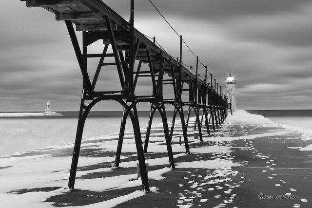
- Low contrast / low color situation. Winter scenes and overcast days seem to work well in B&W because you can get more texture out of the snow or clouds by adding contrast without getting the effect of to much noise like you would get pushing the contrast on color photos. This is a exaple of what I am talking about...
Manistee Lighthouse B&W-4176 by westmichigan, on Flickr
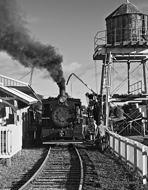
- When you want something to to have a vintage look (look old). I like old things, and like talking pictures of them; but the color photos just look wrong. As an example, every year I go to and Old Engine Show - it is a big event where people from all over the midwest bring their old steam traction engines (old steam tractors), old trucks, and they have working steam engine trains. Here is an example of a steam engine (I actually like another version that I have where the blue sky was turned dark to get the clouds to show up better):
Train - Steam Engine-8064 by westmichigan, on Flickr
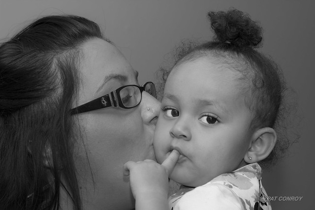
- Portraits to make skin problems go away. I suck at portraits, and I found it difficult to remove acne without making the skin look fake... I have family members with severe acne issues, and it is difficult to deal with. B&W also helps to take care of some of shadows due to pour lighting (another failing of mine). This is not a great reason to use B&W, but it does help. Here is one I like... it was not an acne issue, but the texture of the skin was a little off, and I just liked the look of the B&W version.
A Mothers Love-9409 by westmichigan, on Flickr
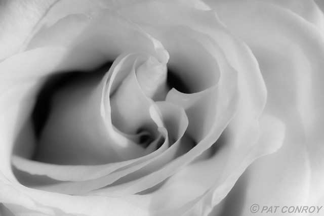
- Reduce distractions and just enjoy the form. I have found that nature has a way producing some very beautiful forms, and sometimes it is just nice to enjoy the form in a way that eliminates all the distractions so you can enjoy the pure form. As an example, I love the look of roses and how the peddles come together in the center. I took so many pictures of roses, but it was always about the color and not the form. So I turned it to B&W, and reduced the sharpness to create a soft form. This has turned into my favorite rose.
Rose-2839 by westmichigan, on Flickr
These are only my own musings. I find myself converting to B&W more and more, and I find myself looking for subjects for B&W compositions. I am not trying to suggest these are good reasons or the only reasons for B&W, but I would like to hear more peoples motivation for B&W... be it artistic, or to solve a photographic/compositional need.
5DS R, 1D X, 7D, Sigma 10-20mm f/4-5.6, 24mm f/1.4L II, 16-35mm f/4L IS, 24-105mm f/4L, 50mm f/1.8, 100mm Macro f/2.8L, 70-200mm f/2.8L IS II, 100-400mm f/4.5-5.6L, 580EX-II
flickr
This is a technique for B&W conversion is one that I use in Photoshop
It uses Channel Mixer
I chose this photo outside the Pompidou in Paris because it covers a yellow red green blue spectrum
and has a good chance of covering a wide gray scale when converted.
Hopefully you can click on this and enlarge it.
Notice the wide range of color.
For this conversion I am using Photoshop.
I skipped RAW editing for simplicity.
Opened the photo and created an adjustment layer
Layer/Adjustment Layer/Channel mixer/OK
Choose monochrome on the pop up
then adjust BLUE/GREEN/RED SLIDERS.
Notice how the Blues end up being the blacks,
Yellows and Reds are white
Greens are midtones grays.
I did two additional adjustments
Layers/Adjustment Layer/Levels
and
Layers/Adjustment Layer/Curves
The resulting histogram reaches the left black and the right white end of the spectrum
and the middle portion of the histogram is rather flat.
Thus this photo no has a wide spectrum of the gray scale.
Is this the best result? Not necessarily
But it does illustrate one of the many methods of B&W conversion available (at least in Photoshop)
and it again points out that blues go to black, greens to midtones, and reds/yell to white
Hope this helps in your B&W shot selection.
Last edited by iND; 07-08-2013 at 12:07 AM.

My wife took this one and I tried to do the post on it. I think the face/hair/head offer good contrast for a B&W, but I don't like how midtone the shirt appears. On the other hand, perhaps this will help draw the eye to the face. Suggestions?
130602-0060-JAR.jpg by rlriii13, on Flickr
What color is the shirt and stripes? Take the sliders for those colors and increase/decrease the intensity of the colors. Even Lightroom will allow you to do so.
5DS R, 1D X, 7D, Sigma 10-20mm f/4-5.6, 24mm f/1.4L II, 16-35mm f/4L IS, 24-105mm f/4L, 50mm f/1.8, 100mm Macro f/2.8L, 70-200mm f/2.8L IS II, 100-400mm f/4.5-5.6L, 580EX-II
flickr
Thanks for the tip. I'll try that out.
But, seeing as this thread contains discussion about B&W philosophies in practice, I suppose I'd like to ask, "Should I?" Should I adjust the shirt, or would more contrast draw attention away from the face? Is it ok to leave something that fills up one quarter of the frame so grey? How would my TDP folks handle this B&W situation?
 Posting Permissions

 Reply With Quote