Page 2 of 2 FirstFirst 12
Results 11 to 20 of 20

Thread: Mini Cake for C&C

  1. #11
    Senior Member MrGreenBug's Avatar
    Join Date
    Dec 2008
    Location
    Quezon City, Philippines
    Posts
    409

    Re: Mini Cake for C&C


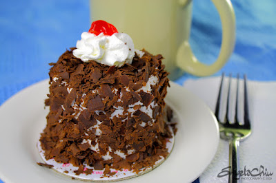
    Got a chance to revisit the post processing the photo above. I was able to get some detail out of the whipped cream but I'm not quite sure how it turned out. I feel that the overall photo became underexposed.


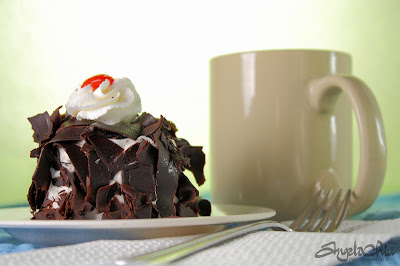
    Moreover, I was lucky to have a chance again to take photos of the mini cakes. I changed the perspective. I shot lower almost level to the table the cake was on. Your C&Cs again will be very much appreciated.


    18-55mm IS @ 55mm, f/5.6, 1/20sec, ISO 100


    Thank you again for viewing.


    Cheers!
    --
    AnGelo Chiu (MrGreenBug in Flickr), Blog: http://mrgreenbug.blogspot.com

  2. #12
    Senior Member
    Join Date
    Dec 2008
    Posts
    327

    Re: Mini Cake for C&C


    Just fixing the white balance on the original shot was a vast improvement. Accurate WB is absolutely critical to food photography--people are very sensitive to color casts for food.


    Second image is good. I think you actually need to strike a balance between the two angles; one is too high, the other too low. Try something in between. Try making the background more color-neutral.


    If you want to see really professional food photography, just visit Martha Stewart's website. Study how they shot the image. How did they make the food as appealing as possible?

  3. #13
    Senior Member
    Join Date
    Dec 2008
    Posts
    745

    Re: Mini Cake for C&C


    Ok - wow, I'm impressed.


    First, the fix to the original picture seemed to me for the first moment like you had taken the picture again. Now it looks much better (but all the original comments/suggestion still hold).


    As for the new shot - awesome! the low angle and the fork that is now more in focus look great - almost like a professional shot [H]


    With that said, it's still to tight in my opinion - specifically on the left hand side of the frame.


    Good job!

  4. #14
    Senior Member MrGreenBug's Avatar
    Join Date
    Dec 2008
    Location
    Quezon City, Philippines
    Posts
    409

    Re: Mini Cake for C&C


    Quote Originally Posted by wickerprints


    Just fixing the white balance on
    the original shot was a vast improvement. Accurate WB is absolutely
    critical to food photography--people are very sensitive to color casts
    for food.


    Second image is good. I think you actually need to strike a balance
    between the two angles; one is too high, the other too low. Try
    something in between. Try making the background more color-neutral.


    If you want to see really professional food photography, just visit
    Martha Stewart's website. Study how they shot the image. How did they
    make the food as appealing as possible?


    Thank you wickerprints for your comments and suggestions. Thank you for pointing out about the WB and color cast for food, I haven't read upon that yet. I'll look at MS website soon. Thanks for referring a site.


    Quote Originally Posted by Oren


    Ok - wow, I'm impressed.


    First, the fix to the original picture seemed to me for the first moment like you had taken the picture again. Now it looks much better (but all the original comments/suggestion still hold).


    As for the new shot - awesome! the low angle and the fork that is now more in focus look great - almost like a professional shot [img]/emoticons/emotion-11.gif[/img]


    With that said, it's still to tight in my opinion - specifically on the left hand side of the frame.


    Good job!
    <div style="clear: both;"]</div>


    Thanks Oren! Composition wise on the first photo can't be change in PS. []


    About the second photo, thank you! As I have limited space to work with, I opted to take tight shots or else I'd be including the rest of the unwanted background. []


    Thank you again guys for the wonderful comments, suggestions, and support!


    Cheers!
    Cheers!
    --
    AnGelo Chiu (MrGreenBug in Flickr), Blog: http://mrgreenbug.blogspot.com

  5. #15
    Senior Member
    Join Date
    Dec 2008
    Posts
    745

    Re: Mini Cake for C&C


    Quote Originally Posted by MrGreenBug


    I opted to take tight shots or else I'd be including the rest of the unwanted background.
    <div style="clear: both;"]</div>


    I hate when it happens (and it happens too many times!).

  6. #16

    Re: Mini Cake for C&C


    Here's a suggestion that might or might not be helpful...the overall mood of both shots would be a better match for breakfast than for cake. It's not just the yellowish-green cast of the first image, although that does contribute to the "morning" look. Have you considered using background colors that are more in the earth tone range, or a dark wood table with a dark brown or maroon linen napkin? One other idea would be to use lighting that's a little less smooth -- think evening and drama and moodiness. It will accentuate the specialness of the cake. Another suggestion would be to put the fork on the left or very carefully arrange it on the plate.


    This just occurred to me, but you could also try putting an ad on Craigslist for a food stylist -- professional stylists have all kinds of tricks. It might be worth hiring one for a couple of sessions just for the learning experience.


    Good luck and good cake!


  7. #17
    Senior Member MrGreenBug's Avatar
    Join Date
    Dec 2008
    Location
    Quezon City, Philippines
    Posts
    409

    Re: Mini Cake for C&C


    Quote Originally Posted by Oren


    I hate when it happens (and it happens too many times!).
    <div style="CLEAR: both"]</div>

    I can't say it better than this.. []
    Cheers!
    --
    AnGelo Chiu (MrGreenBug in Flickr), Blog: http://mrgreenbug.blogspot.com

  8. #18
    Senior Member
    Join Date
    Dec 2008
    Posts
    103

    Re: Mini Cake for C&C


    Love the redo! The whole thing looks new with just a shift in white balance. I also like the lower angle. There are a lot of things that make it cool, but I think that the color is too flat. Not that it is particularly bad, but there is an element that is missing with so little color in the image. I would suggest that the mug be a muted color that is not the same as the background. You don't want to have a bright color on it since that would draw attention from the subject but it looks flat with a background the same color as the mug. The reason that I noticed this was the large amount of blue you have for a background and it seems to just give it that amount of color that make it attractive to look at as a whole.


    Just my two cents,


    Samuel

  9. #19
    Senior Member MrGreenBug's Avatar
    Join Date
    Dec 2008
    Location
    Quezon City, Philippines
    Posts
    409

    Re: Mini Cake for C&C


    Quote Originally Posted by Jeff Lucia


    Here's a suggestion that might or might not be helpful...the overall mood of both shots would be a better match for breakfast than for cake. It's not just the yellowish-green cast of the first image, although that does contribute to the "morning" look. Have you considered using background colors that are more in the earth tone range, or a dark wood table with a dark brown or maroon linen napkin? One other idea would be to use lighting that's a little less smooth -- think evening and drama and moodiness. It will accentuate the specialness of the cake. Another suggestion would be to put the fork on the left or very carefully arrange it on the plate.


    This just occurred to me, but you could also try putting an ad on Craigslist for a food stylist -- professional stylists have all kinds of tricks. It might be worth hiring one for a couple of sessions just for the learning experience.
    <div style="CLEAR: both"]</div>


    Thanks Jeff for the wonderful input. Indeed, the photos have a "breakfast feeling" in it. I'll try on your suggestions when I get the chance to have one those mini cakes again. []


    Quote Originally Posted by Jeff Lucia


    Good luck and good cake!


    <div style="CLEAR: both"]</div>

    Wonderful!
    Cheers!
    --
    AnGelo Chiu (MrGreenBug in Flickr), Blog: http://mrgreenbug.blogspot.com

  10. #20
    Senior Member MrGreenBug's Avatar
    Join Date
    Dec 2008
    Location
    Quezon City, Philippines
    Posts
    409

    Re: Mini Cake for C&C


    Quote Originally Posted by Flaming


    Love the redo! The whole thing looks new with just a shift in white balance. I also like the lower angle. There are a lot of things that make it cool, but I think that the color is too flat. Not that it is particularly bad, but there is an element that is missing with so little color in the image. I would suggest that the mug be a muted color that is not the same as the background. You don't want to have a bright color on it since that would draw attention from the subject but it looks flat with a background the same color as the mug. The reason that I noticed this was the large amount of blue you have for a background and it seems to just give it that amount of color that make it attractive to look at as a whole.


    Just my two cents,


    Samuel
    <p style="CLEAR: both"]

    Thank you, Samuel for the comments and suggestions. I like your suggestion regarding the mug. I'll try to do a combination of your suggestion and Jeff's when I get the chance to get some of those mini cakes again -- hopefully soon!


    Cheers!
    Cheers!
    --
    AnGelo Chiu (MrGreenBug in Flickr), Blog: http://mrgreenbug.blogspot.com

Posting Permissions

  • You may not post new threads
  • You may not post replies
  • You may not post attachments
  • You may not edit your posts
  •