Page 1 of 2 12 LastLast
Results 1 to 10 of 18

Thread: Thoughts?

  1. #1
    Super Moderator Kayaker72's Avatar
    Join Date
    Jan 2009
    Location
    New Hampshire, USA
    Posts
    5,676

    Thoughts?

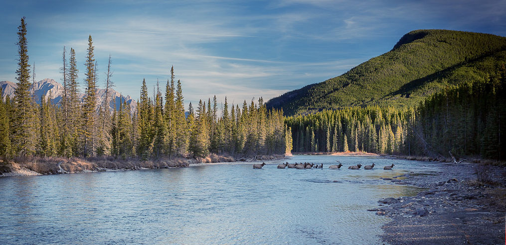
    I haven't been able to get this image quite right, IMO. I was wondering if anyone had thoughts on how to post-process it differently?

    Small-1092 by kayaker72, on Flickr

    I was actually shooting a mountain when I looked behind and saw the elk crossing the river. So I had the 24-70 II with CPL on my camera and only make a few minor adjustments and then started shooting.

    I didn't take the time to adjust the CPL and am concerned that is part of the reason the colors just seem a bit off.

  2. #2
    Senior Member
    Join Date
    Jan 2009
    Location
    Ottawa, ON
    Posts
    1,472
    It seems slightly tilted to the left to me, which stood out more than the elk (I didn't even see the elk at first, but the tilt jumped right out at me). So the first step is removing that distraction.

    After that, perhaps it's got a bit too much blue (mountain shadows look grey-blue to me, and distant trees are perhaps a bit blue too). The slight downward curve to the blue channel should fix that. I have no software to play with it while I'm at work, so I can't check to see if that advice helps or hinders the image... but it gives you something to try while waiting for another reply.
    On Flickr - Namethatnobodyelsetook on Flickr
    R8 | R7 | 7DII | 10-18mm STM | 24-70mm f/4L | Sigma 35mm f/1.4 | 50mm f/1.8 | 85mm f/1.8 | 70-300mm f/4-5.6L | RF 100-500mm f/4-5-7.1L

  3. #3
    Senior Member
    Join Date
    Jan 2009
    Location
    Central Kentucky
    Posts
    3,619
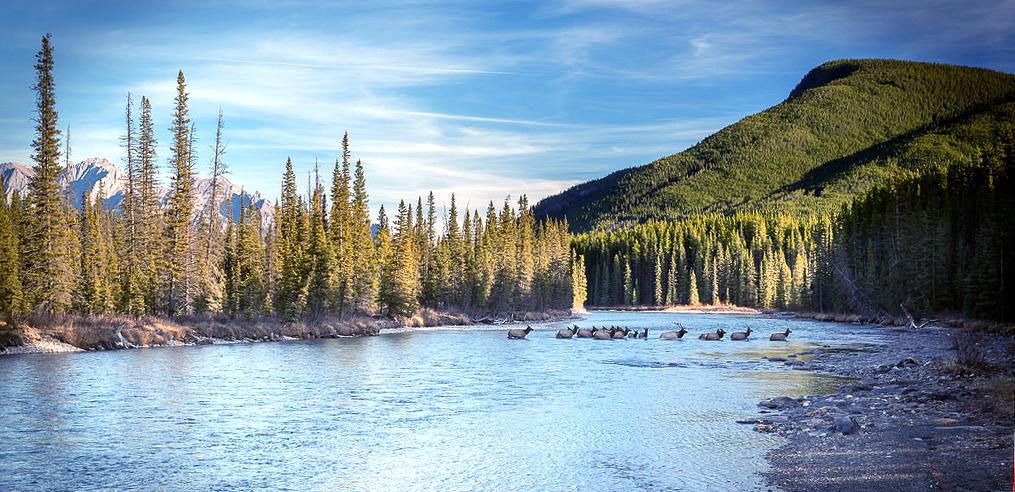
    Not being there I wasn't sure what you were going for but it looks too warm or too red to me.....I took this into Photoshop and applied Nik Pro-Contrast filter with color correction and dynamic contrast....that helped a little....then I opened the channel mixer on the red channel and reduced it to 86% which I think helped more. Then I tried to remove the vignette with the dodge tool. I wasn't able to get all the red out of the trees in the upper right corner. Is this more like you saw it or is it too green now?


  4. #4
    Senior Member Dave Throgmartin's Avatar
    Join Date
    Jan 2009
    Location
    Northern Illinois
    Posts
    1,061
    If you want to post the RAW people could take a try at it. I think the original is a bit too warm and Joel's a bit too cool.

    Dave

  5. #5
    Senior Member
    Join Date
    Jan 2009
    Location
    Ottawa, ON
    Posts
    1,472
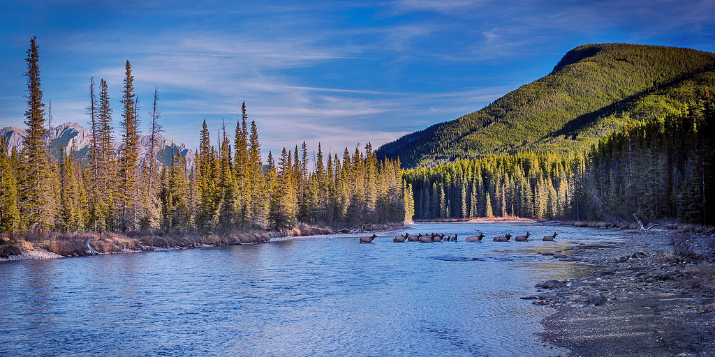
    I dropped the reds, boosted the blues, and straightened a bit, and got this:


    KayakerFix by Dave E, on Flickr

    Which seemed to lack punch, so I did a Levels adjustment to add some targeted contrast adjustment (dropped the input highs a bit, and dragged the midpoint to a bit left (darker) from center. That gets this:


    KayakerFix2 by Dave E, on Flickr

    Hopefully the images come through even when set to private on Flickr...
    On Flickr - Namethatnobodyelsetook on Flickr
    R8 | R7 | 7DII | 10-18mm STM | 24-70mm f/4L | Sigma 35mm f/1.4 | 50mm f/1.8 | 85mm f/1.8 | 70-300mm f/4-5.6L | RF 100-500mm f/4-5-7.1L

  6. #6
    Senior Member Jayson's Avatar
    Join Date
    Jan 2009
    Location
    Nebraska, USA
    Posts
    1,909
    Quote Originally Posted by Kayaker72 View Post
    I haven't been able to get this image quite right, IMO. I was wondering if anyone had thoughts on how to post-process it differently?

    Small-1092 by kayaker72, on Flickr

    I was actually shooting a mountain when I looked behind and saw the elk crossing the river. So I had the 24-70 II with CPL on my camera and only make a few minor adjustments and then started shooting.

    I didn't take the time to adjust the CPL and am concerned that is part of the reason the colors just seem a bit off.
    Have you ever tried using luminosity masks? I think it might bring up the shadows and help with any highlights. I would love to give it a shot and see what I can come up with. I would screen shot the PS file if you wanted. I enjoy messing with stuff like this. Beautiful photo by the way!

  7. #7
    Senior Member
    Join Date
    Jan 2009
    Location
    South West Ontario
    Posts
    466
    It looks like a lot of folks are going to take a kick at the can. The two items that topped my list were the colour cast and the lack of excitement in the mid-tones. Using the clouds to click on for the white balance left it a little cool looking for the time of day so i warmed it up a bit on temperature and added small amount of magenta tone as the sun is low in the sky. To bring out more mid-tones I reduced the highlights, boosted the shadows, and then applied some clarity to bring back some contrast there. The vignetting edge is rather hard and circular so I am wondering if the filter could be a bit thinner. I also cropped it a bit to try to strengthen the presence of the elk.

    Attached Thumbnails Attached Thumbnails Click image for larger version. 

Name:	Elk (2).jpg 
Views:	279 
Size:	113.2 KB 
ID:	2514  
    Last edited by jrw; 10-28-2015 at 03:05 AM. Reason: Bad typing edited

  8. #8
    Senior Member
    Join Date
    Jan 2009
    Location
    Planet Earth
    Posts
    3,110
    I would try and get the color of the Elk right, if you get the Elk right everything else would probably follow.
    To me it looks like the shadows are brought up to much. The Elk are to bright and a bit washed out.
    Your WB might be off a bit, adjust it until the Elk look right. If everything else is off and the Elk are not correct I think you have to do major surgery to make the most of the picture.

    JRW's suggestion to crop is solid. The Elk are a focal point, the landscape frame them. In the original photo the river bank is disproportional.

    The Elk have to be correct IMO.

  9. #9
    Zach
    Guest
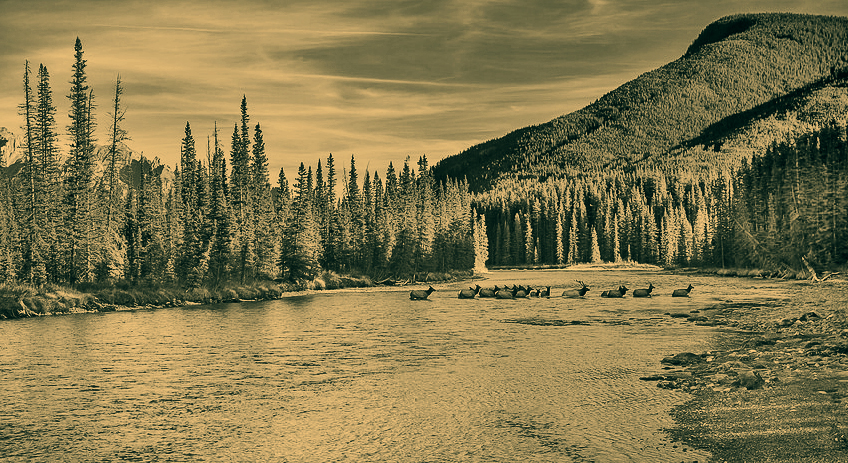
    thought i'd take a crack at this

    tryout 1
    Kayaker72 tryout 1 by zach thompson, on Flickr

    tryout 2
    Kayaker72 tryout 2 by zach thompson, on Flickr

    I went for a ansel adams look here

  10. #10
    Super Moderator Kayaker72's Avatar
    Join Date
    Jan 2009
    Location
    New Hampshire, USA
    Posts
    5,676
    Ok...you all are getting closer than I was.

    I agree that I am probably trying to life the shadows too much and the red channel. I am playing with it more and it is getting closer.

    Quote Originally Posted by Dave Throgmartin View Post
    If you want to post the RAW people could take a try at it. I think the original is a bit too warm and Joel's a bit too cool.

    Dave
    I also included two shots @ 70 mm for those wanting to focus on the elk for those wanting to give this a shot.

    https://www.dropbox.com/sh/1dzj7657l...bvVa?dl=0&s=so

Posting Permissions

  • You may not post new threads
  • You may not post replies
  • You may not post attachments
  • You may not edit your posts
  •